library(DOSE)
data(geneList)
de <- names(geneList)[abs(geneList) > 2]

edo <- enrichDO(de)27 Common summary plots for enrichment results
| Aspect | Summary plots |
|---|---|
| Question | Which terms are enriched, how should they be ranked or filtered, and what information should be shown first? |
| Input | A checked enrichResult, gseaResult, or compatible result object with term statistics and labels. |
| Functions | barplot(), dotplot(), and summary-oriented extensions such as Manhattan or rich-factor views. |
| Output | Compact term-level figures for screening and reporting; the figure does not change the result object. |
| Limitations | Ordering and display choices can hide universe differences, effect/coverage, redundancy, and direction. Do not treat visual rank as a new statistical test. |
Use these plots after checking the result object and before moving to gene–term networks or GSEA views.
27.1 Bar Plot
Bar plot is the most widely used method to visualize enriched terms. It depicts the enrichment scores (e.g. p values) and gene count or ratio as bar height and color Figure 27.1. Users can specify the number of terms (most significant) or selected terms (see also the FAQ) to display via the showCategory parameter.
library(enrichplot)
barplot(edo, showCategory=20)
Other variables that derived using mutate can also be used as bar height or color as demonstrated in Section 19.4 and Figure 27.1.
library(clusterProfiler)

mutate(edo, qscore = -log(p.adjust, base=10)) |>
    barplot(x="qscore")
library(clusterProfiler) is not optional here. mutate() on an enrichResult works through an S3 method that clusterProfiler registers on load, so if only DOSE (or another downstream package) has been loaded, mutate() falls back to dplyr::mutate and fails with no applicable method for 'mutate' applied to an object of class "enrichResult".

27.1.1 Split top categories by ontology
When visualizing GO enrichment across all ontologies (ont = "ALL"), it is often more informative to show the top terms within each ontology (BP/CC/MF) rather than selecting the top terms globally. barplot() forwards additional arguments via ..., and one useful option is split. Setting split = "ONTOLOGY" will perform the “top N per ontology” selection and makes it straightforward to color (and later facet) the results by the ontology.
library(enrichplot)
library(ggplot2)

p_nofacet <- barplot(
  ego_all,
  x = "Count",
  showCategory = 15,
  split = "ONTOLOGY"
) +
  aes(fill = ONTOLOGY) +
  scale_fill_brewer(palette = "Set2")

p_nofacet +
  geom_text(aes(label = Count), nudge_x = 2) +
  scale_y_discrete()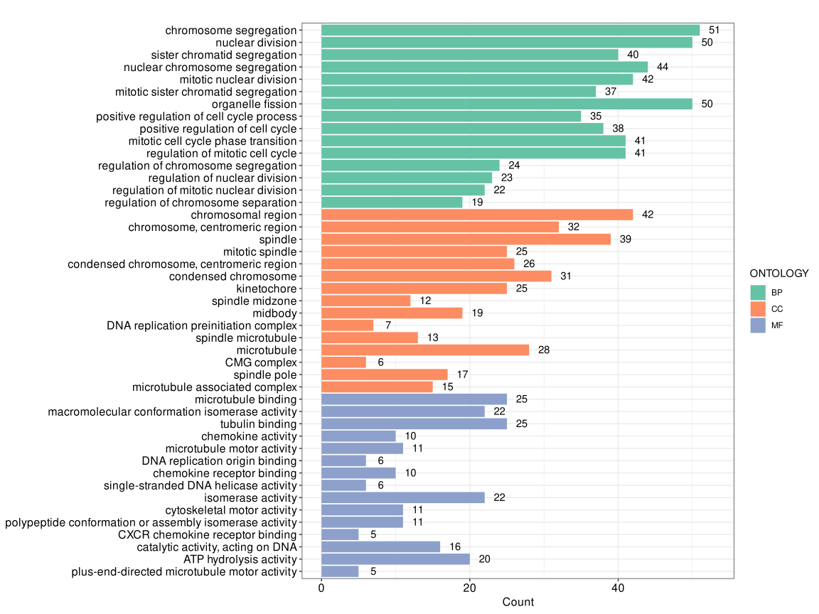
split = "ONTOLOGY" (no faceting).
Note that barplot() wraps long term descriptions onto multiple lines by default (controlled by label_format, default is 30). If you prefer to keep the y-axis labels on a single line, you can override the default scale by adding + scale_y_discrete() as shown above.
p_facet <- barplot(
  ego_all,
  x = "Count",
  showCategory = 15,
  split = "ONTOLOGY"
) +
  aes(fill = ONTOLOGY) +
  scale_fill_brewer(palette = "Set2") +
  enrichplot::autofacet(by = "row", scales = "free")

p_facet + scale_y_discrete()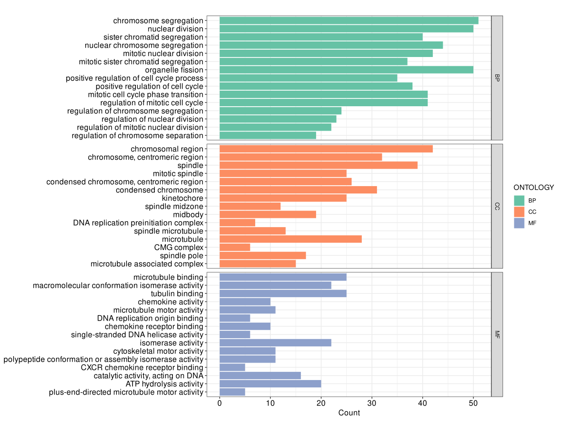
autofacet() splitting by ontology.
If the fortified data contain an ONTOLOGY column (as in the output generated by split = "ONTOLOGY"), you can facet the plot directly with + enrichplot::autofacet(), and it will automatically split panels by ontology.
27.2 Dot plot
Dot plot is similar to bar plot with the capability to encode another score as dot size.
library(ggplot2)
edo2 <- gseDO(geneList)
dotplot(edo, showCategory=30, label_format=NULL) + ggtitle("dotplot for ORA")
dotplot(edo2, showCategory=30, label_format=NULL) + ggtitle("dotplot for GSEA")


Note: The dotplot() function also works with compareCluster() output.
27.2.1 Highlighting specific pathways
The label_format parameter in dotplot() accepts a function to format y-axis labels, which can be used to highlight specific pathways. This is useful for emphasizing pathways of interest in publication figures.
First, perform enrichment analysis:
library(DOSE)
data(geneList)
de <- names(geneList)[1:100]
x <- enrichDO(de)
Define a function to highlight pathways containing “cancer”:
f <- function(ids) {
    i <- grepl('cancer', ids)
    ids[i] <- paste0("<i style='color:#009E73'>", ids[i], "</i>")
    return(ids)
}
To render the HTML formatting, use the ggtext package with element_markdown():
library(ggplot2)
library(ggtext)
library(enrichplot)
dotplot(x, label_format=f) + theme(axis.text.y = element_markdown())
You can also highlight specific pathways by index:
f2 <- function(ids) {
    ids[1] <- paste0("<i style='color:#009E73'>", ids[1], "</i>")
    ids[2] <- paste0("<i style='color:#0072B2'>**", ids[2], "**</i>")
    return(ids)
}

dotplot(x, label_format=f2) + theme(axis.text.y = element_markdown())
Or apply different colors to all pathways:
f3 <- function(ids) {
    # cols <- rcartocolor::carto_pal(length(ids), "Vivid")
    # cols <- colorspace::rainbow_hcl(length(ids))
    cols <- rainbow(length(ids))
    ids <- paste0("<i style='color:", cols, "'>**", ids, "**</i>")
    return(ids)
}

dotplot(x, label_format=f3) + theme(axis.text.y = element_markdown())
27.2.2 Formula interface of dotplot
The x variable of dotplot() supports a formula interface, allowing users to use derived variables. For example, we can calculate GeneRatio/BgRatio or -log(p.adjust) and use them as the x-axis variable.
p1 <- dotplot(edo, x = ~GeneRatio/BgRatio)
p2 <- dotplot(edo, x = ~ -log(p.adjust))
plot_list(p1, p2, ncol=2, tag_levels='A')
x = ~GeneRatio/BgRatio. (B) x = ~ -log(p.adjust).
This feature provides great flexibility in visualization. For instance, the Rich Factor is a common metric defined as the ratio of the number of differentially expressed genes annotated in a pathway to the total number of genes annotated in that pathway.
\[Rich Factor = \frac{Count}{BgRatio \times N}\]
where \(N\) is the total number of genes in the background distribution.
We can easily visualize the Rich Factor using the formula interface.
N <- 8007 # total number of genes in the background
dotplot(edo, x = ~Count/(BgRatio * N))
Alternatively, you can precompute derived variables with mutate() (e.g., add neglog10p = -log10(p.adjust) or richFactor = Count / (BgRatio * N)) and then pass the new column name to x. This approach is useful when you want to reuse the computed variables across multiple plots. See the dedicated section on using dplyr verbs with enrichment results in Section 19.4.
27.2.3 Adjusting dot sizes
To increase the size of the dots in the dot plot, we can use the scale_size function from the ggplot2 package. This allows us to specify the range of the dot sizes.
p1 <- dotplot(edo, showCategory=10) + ggtitle("Default")
p2 <- dotplot(edo, showCategory=10) + scale_size(range=c(2, 20)) + ggtitle("Adjusted size")
plot_list(p1, p2, ncol=2, tag_levels='A')
scale_size(range=c(2, 20)).
27.3 Manhattan plot
The manhattanplot() function provides a landscape-style overview of enrichment results. It arranges enriched terms along the x-axis by ontology (or by category in compareCluster() results), uses -log10() transformed significance values on the y-axis, and maps term size to a variable such as Count. The most significant terms can be labeled automatically with showCategory, making it useful for summarizing a large number of enriched terms in a single plot.
When GO enrichment is performed with ont = "ALL", manhattanplot() can display the top terms across BP, CC, and MF simultaneously by combining it with split = "ONTOLOGY".
manhattanplot(
  ego_all,
  color = "p.adjust",
  showCategory = 12,
  size = "Count",
  split = "ONTOLOGY",
  title = "GO enrichment landscape"
)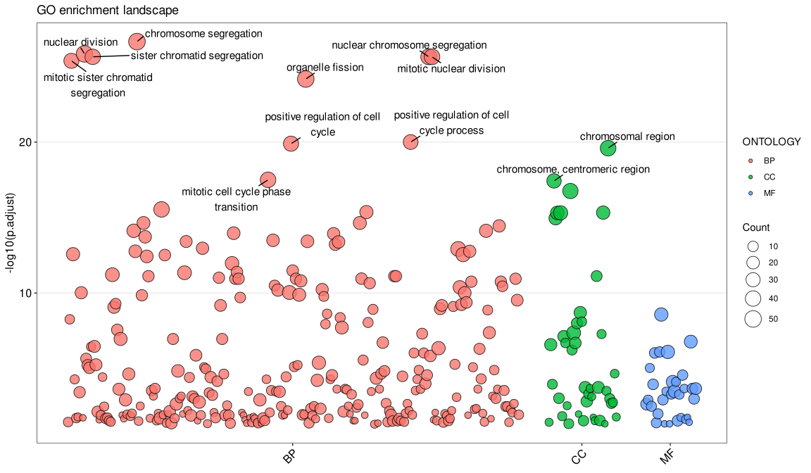
-log10(p.adjust).
The manhattanplot() function also supports gseaResult, enrichResultList, gseaResultList, and compareClusterResult objects, which makes it convenient for comparing the distribution of significant terms across multiple ontologies or experimental groups.
27.4 Next steps
- For gene–term relationships, continue to network plots.
- For result comparison, see compare functional profiles.