library(clusterProfiler)
library(enrichplot)
library(DOSE)
library(org.Hs.eg.db)
data(gcSample)
data(geneList, package = "DOSE")

# Use a local GO mapping for deterministic compareCluster examples rather
# than requiring the KEGG REST service during every book build.
go_map <- AnnotationDbi::select(
    org.Hs.eg.db,
    keys = keys(org.Hs.eg.db, keytype = "ENTREZID"),
    columns = c("GO", "ONTOLOGY"),
    keytype = "ENTREZID"
) |>
    dplyr::filter(!is.na(GO), ONTOLOGY == "BP") |>
    dplyr::transmute(term = GO, gene = ENTREZID) |>
    dplyr::distinct()
go_names <- AnnotationDbi::select(
    GO.db::GO.db,
    keys = unique(go_map$term),
    columns = "TERM",
    keytype = "GOID"
) |>
    dplyr::filter(!is.na(TERM)) |>
    dplyr::transmute(term = GOID, name = TERM) |>
    dplyr::distinct()
xx <- compareCluster(
    gcSample,
    fun = "enricher",
    TERM2GENE = go_map,
    TERM2NAME = go_names,
    universe = names(geneList),
    pvalueCutoff = 1,
    qvalueCutoff = 1,
    minGSSize = 5
)
xx <- pairwise_termsim(xx)30 Compare functional profiles
| Aspect | Comparison views |
|---|---|
| Question | How do functional profiles differ across clusters, conditions, or experimental groups? |
| Input | A checked compareClusterResult with comparable input rules, universe definitions, and database identity across groups. |
| Functions | dotplot() and comparison-specific profile, network, and facet helpers. |
| Output | Comparative term tables and figures that expose shared and group-specific enrichment patterns. |
| Limitations | Visual differences can reflect different input sizes, backgrounds, filtering, or annotation coverage. The plot does not replace a formal between-group model. |
Keep the statistical comparison design in the analysis-engine chapters; use these plots to communicate the resulting profiles.
30.1 Dotplot2: Comparing two clusters
The focused dotplot2() example belongs here because it compares selected groups rather than introducing a new statistical test.
dotplot2(
    xx,
    vars = c("X1", "X2"),
    x = "FoldEnrichment",
    showCategory = 5,
    label_format = 30,
    font.size = 10
) +
    ggplot2::labs(
        title = "X1 versus X2",
        subtitle = "Terms selected separately within each cluster"
    )
dotplot2() accepts the same plotting controls as dotplot() but requires exactly two cluster labels in vars. The left and right sides show the selected clusters on a shared fold-enrichment scale; the dashed center line marks no enrichment difference. This is a visual comparison, not a replacement for a formal between-group test.
30.2 Enrichment maps for compareCluster results
compareCluster() produces a standard comparison object. The map below shows how its functional profiles can be compared visually; the statistical design and multiple-testing questions remain in the analysis-engine chapter.
map_guides <- ggplot2::guides(size = "none")
p1 <- emapplot(
    xx,
    showCategory = 2,
    pie = "equal",
    min_edge = 0.3,
    label_format = 18,
    node_label_size = 3.2,
    show_category_size_legend = FALSE
) + map_guides
p2 <- emapplot(
    xx,
    showCategory = 2,
    pie = "count",
    min_edge = 0.3,
    label_format = 18,
    node_label_size = 3.2,
    show_category_size_legend = FALSE
) + map_guides
p3 <- emapplot(
    xx,
    showCategory = 2,
    pie = "count",
    size_category = 1.2,
    min_edge = 0.3,
    label_format = 18,
    node_label_size = 3.2,
    show_category_size_legend = FALSE
) + map_guides
p4 <- emapplot(
    xx,
    showCategory = 2,
    pie = "count",
    size_category = 1.2,
    layout = "kk",
    min_edge = 0.3,
    label_format = 18,
    node_label_size = 3.2,
    show_category_size_legend = FALSE
) + map_guides
aplot::plot_list(p1, p2, p3, p4, ncol = 2, tag_levels = "A")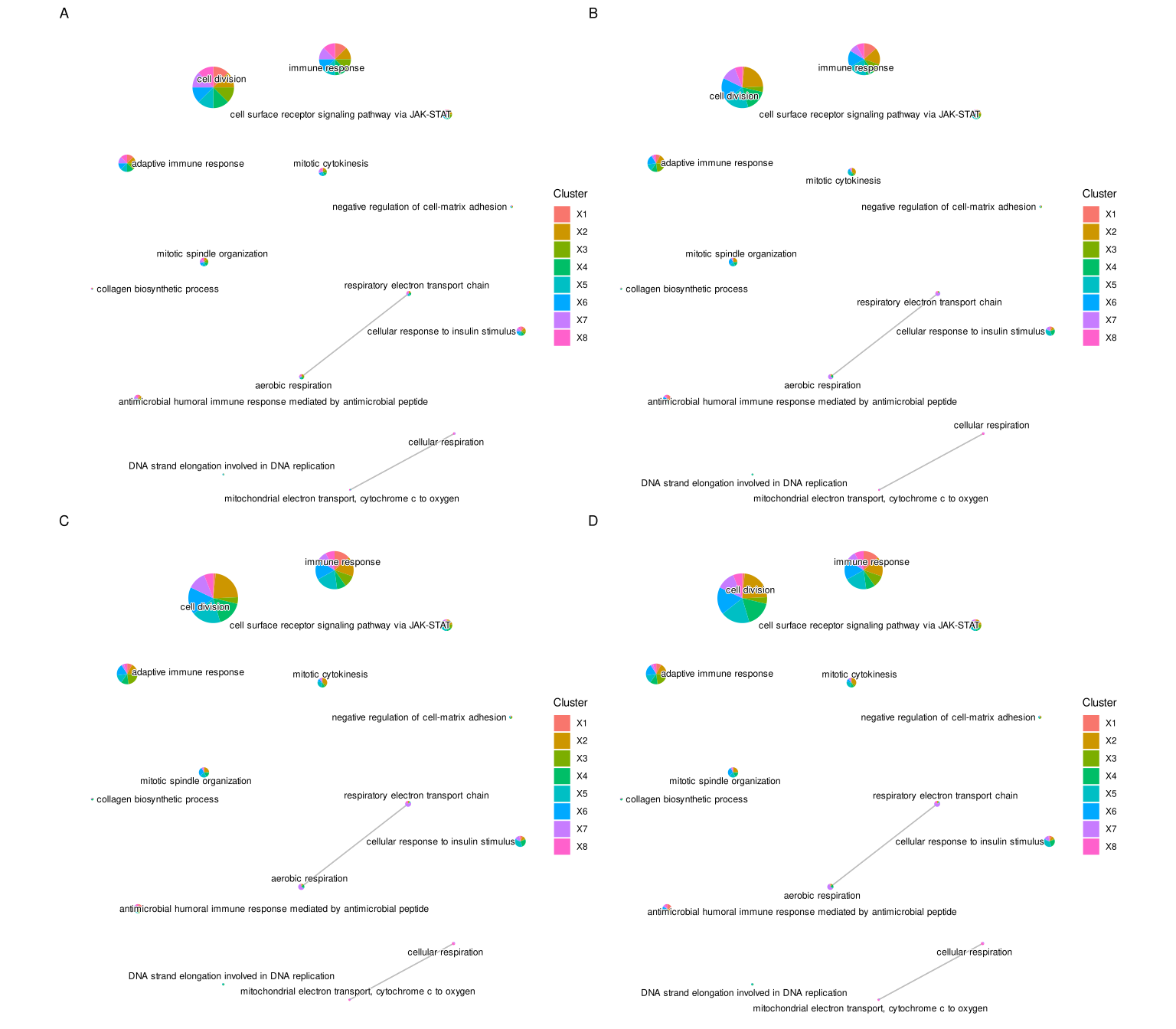
30.3 Next steps
- For the underlying comparison design, see compareCluster.
- For term organization and reporting, continue to evidence integration.