library(DOSE)
data(geneList, package = "DOSE")
de <- names(geneList)[abs(geneList) > 2]
edo <- enrichDO(de)
edo2 <- gseDO(geneList)32 Publication-ready and specialized views
| Aspect | Specialized views |
|---|---|
| Question | How should an already checked result be polished or extended for a report or publication? |
| Input | A validated enrichment or GSEA result object, explicit filtering, and declared export parameters. |
| Functions | set_enrichplot_color(), pmcplot(), volplot(), hplot(), goplot(), and specialized layout helpers. |
| Output | Styled figures and domain-specific views; no new enrichment test is performed. |
| Limitations | Visual polish cannot repair an incorrect identifier namespace, background, database release, or statistical design. Keep the original object and export settings. |
These plots change how a checked result is displayed, not the evidence behind it. Continue to reproducible reporting when exporting figures.
32.1 Unified color setting with set_enrichplot_color()
Add set_enrichplot_color() to an enrichplot graphic with + to change the color scale.
32.1.1 Parameters
type: Type of color aesthetic to modify (default:"fill", can also be"color"for line colors)transform: Transformation to apply to the values used for color mapping"log10": Apply log10 transformation (default for recent versions)"identity": Use original values without transformation
colors: Custom color palette as a vector of colors (e.g.,c("red", "blue"))
32.1.2 Usage examples
# Example data
library(DOSE)
data(geneList)
de <- names(geneList)[abs(geneList) > 2]
edo <- enrichDO(de)

# A: Default log10 transformation
p1 <- dotplot(edo, showCategory=15) +
  set_enrichplot_color(type='fill', transform='log10') +
  ggtitle("Default log10 transform")

# B: Custom colors with log10 transformation
p2 <- dotplot(edo, showCategory=15) +
  set_enrichplot_color(type='fill', transform='log10', colors=c("red", "blue")) +
  ggtitle("Red-blue palette")

# C: Identity transformation (no transformation)
p3 <- dotplot(edo, showCategory=15) +
  set_enrichplot_color(type='fill', transform='identity') +
  ggtitle("Identity transform")

library(aplot)
plot_list(p1, p2, p3, ncol=3, tag_levels='A')
set_enrichplot_color(). (A) Default log10 transformation. (B) Custom red-blue palette with log10 transformation. (C) Identity transformation (no transformation).
Since enrichplot v1.29.2, functions such as dotplot() apply a log10 transformation to p-values by default. Use set_enrichplot_color() to change the transformation or palette.
## Publication trends for enriched terms
pmcplot() shows how often terms appear in PubMed Central over time. It can plot either the number of matching articles or their proportion among all articles returned for each year. Any text accepted by the Europe PMC search can be used as a query.
The example supplies local data so the figure does not depend on a live Europe PMC query. Omit data to query Europe PMC directly. The values below are illustrative rather than literature counts; for a real query, record the terms, year range, response, and access date.
terms <- as.character(edo$Description[1:5])
period <- 2010:2020
pmc_fixture <- expand.grid(
    query = terms,
    year = period,
    KEEP.OUT.ATTRS = FALSE,
    stringsAsFactors = FALSE
)
term_index <- match(pmc_fixture$query, terms)
year_index <- pmc_fixture$year - min(period)
pmc_fixture$all_hits <- 1000 + 35 * year_index
pmc_fixture$query_hits <- 25 + 8 * term_index + 4 * year_index

p <- pmcplot(terms, period, data = pmc_fixture)
p2 <- pmcplot(terms, period, proportion = FALSE, data = pmc_fixture)
aplot::plot_list(p, p2, ncol = 2, tag_levels = "A")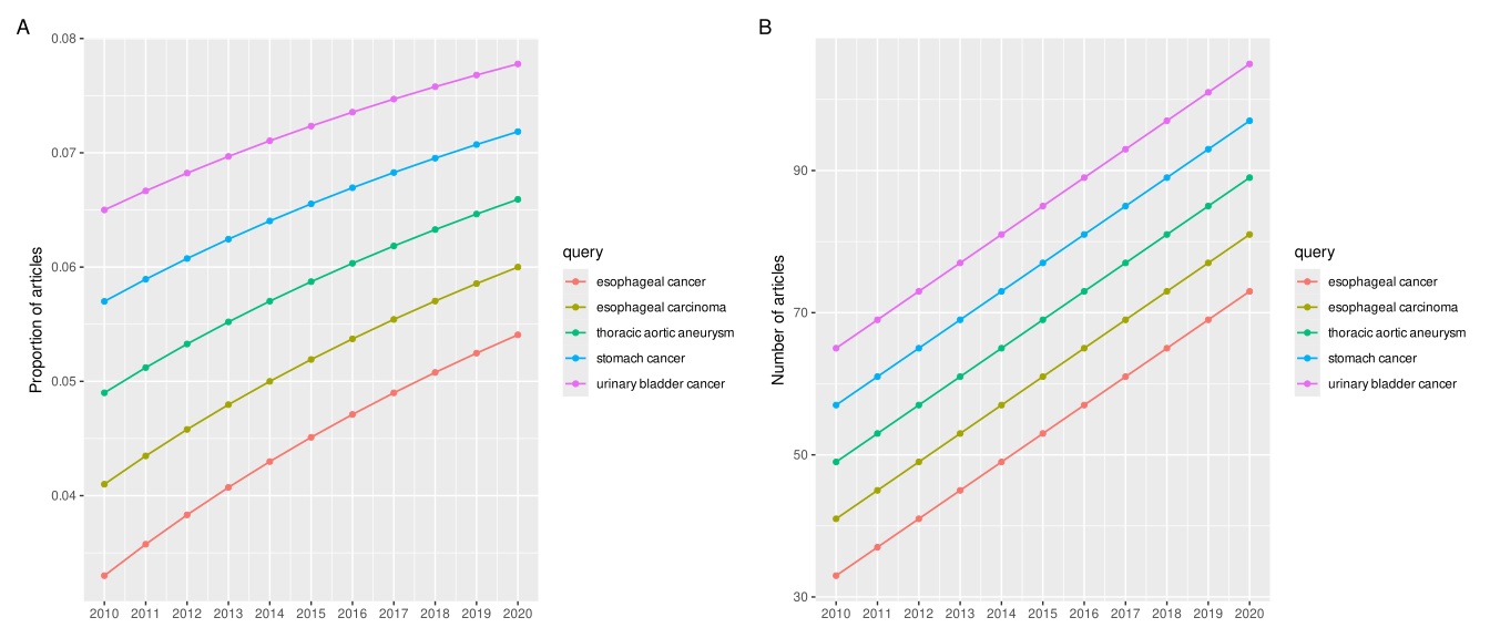
32.2 Volcano plot for ORA results
volplot() displays the relationship between an effect-size measure and statistical significance in an ORA result.
# Example using enrichment result with fold change information
# Note: volplot requires results with fold change values
volplot(edo)
32.3 Horizontal GSEA plot
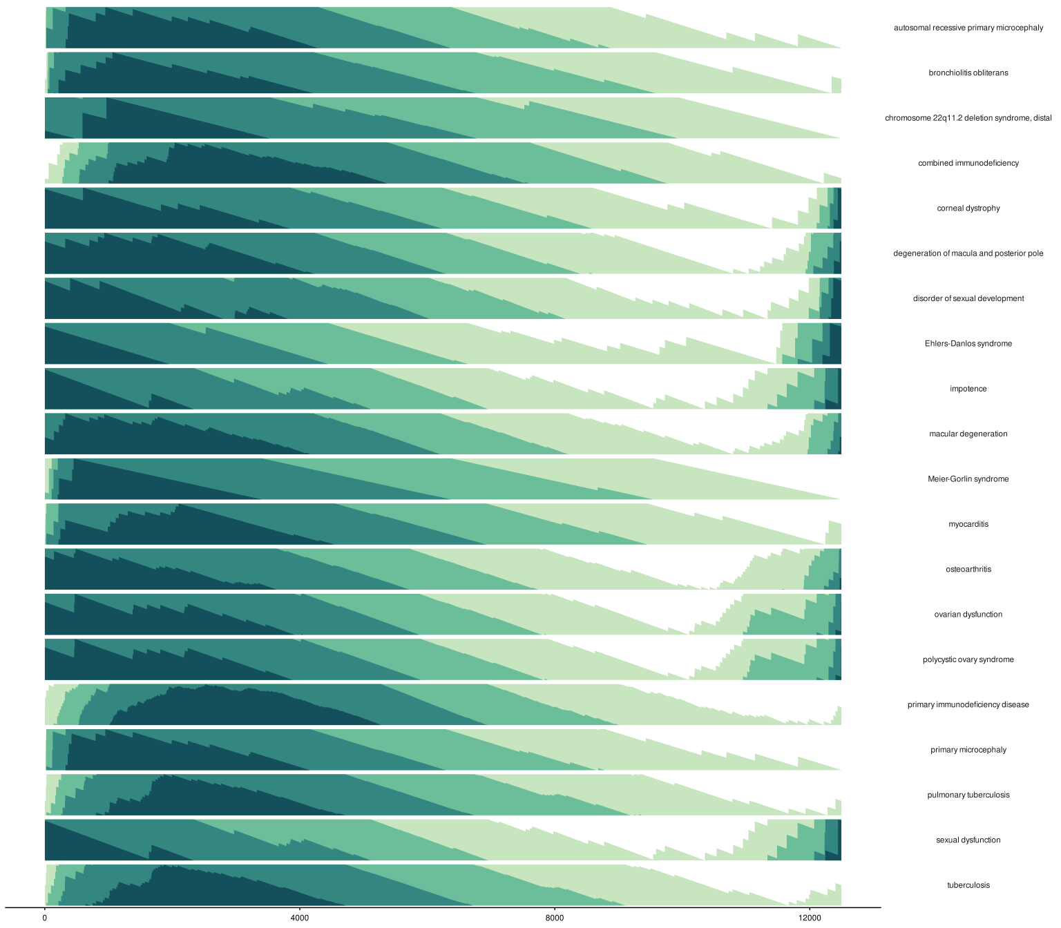
hplot() places one running-score panel beside each gene set, with the ranked-list position on the x-axis. It is useful for comparing many pathways without the dense ranked-metric panel of the full gseaplot() view.
gene_set_id <- edo2 |>
    arrange(desc(abs(NES))) |>
    group_by(sign(NES)) |>
    dplyr::slice(1:10) |>
    as.data.frame() |>
    pull(ID)

hplot(
    edo2,
    geneSetID = gene_set_id
)
32.4 GO Graph
The goplot() function can accept the output of enrichGO and visualize the enriched GO induced graph. See Figure 32.5 for an example.
library(clusterProfiler)
library(org.Hs.eg.db)
data(geneList, package = "DOSE")
de <- names(geneList)[abs(geneList) > 2]
ego <- enrichGO(de, OrgDb = org.Hs.eg.db, ont = "BP", readable = TRUE)goplot(ego)
The plotGOgraph() function is another option to visualize the GO topology.
plotGOgraph(ego)32.5 Next steps
- For standard result summaries, see summary plots.
- For evidence-aware reporting, continue to interpretation.