A Frequently Asked Questions
The ggtree mailing-list18 is a great place to get help, once you have created a reproducible example that illustrates your problem.
A.1 Installation
The ggtree is released within the Bioconductor project; you need to use BiocManager to install it.
## you need to install BiocManager before using it
## install.packages("BiocManager")
library(BiocManager)
install("ggtree")
Bioconductor release is adhered to a specific R version. Please make sure you are using the latest version of R if you want to install the latest release of Bioconductor packages, including ggtree. Beware that bugs will only be fixed in the current release and develop branches. If you find a bug, please follow the guide19 to report it.
To make it easy to install and load multiple core packages in a single step, we created a meta-package, treedataverse. Users can install the package via the following command:
BiocManager::install("YuLab-SMU/treedataverse")Once it is installed, loading the package will also load the core treedataverse packages, including tidytree, treeio, ggtree, and ggtreeExtra.
A.2 Basic R Related
A.2.1 Use your local file
If you are new to R and want to use ggtree for tree visualization, please do
learn some basic R and ggplot2.
A very common issue is that users copy and paste commands without looking at
the function’s behavior. The system.file() function was used in some of our examples to find files packed in the packages.
system.file                package:base                R Documentation

Find Names of R System Files

Description:

     Finds the full file names of files in packages etc.

Usage:

     system.file(..., package = "base", lib.loc = NULL,
                 mustWork = FALSE)
For users who want to use their files, please just use relative or absolute file path (e.g., file = "your/folder/filename").
A.3 Aesthetic mapping
A.3.1 Inherit aesthetic mapping
ggtree(rtree(30)) + geom_point()For example, we can add symbolic points to nodes with geom_point() directly.
The magic here is we don’t need to map the x and y position of the points by providing aes(x, y) to geom_point() since it was already mapped by the ggtree() function and it serves as a global mapping for all layers.
But what if we provide a dataset in a layer and the dataset doesn’t contain columns of x and/or y,
the layer function also tries to map x and y and also others if you map them in the ggtree() function.
As these variables are not available in your dataset, you will get the following error:
Error in eval(expr, envir, enclos) : object 'x' not foundThis can be fixed by using the parameter inherit.aes=FALSE which will disable inheriting mapping from the ggtree() function.
A.3.2 Never use $ in aesthetic mapping
Never do this20 and please refer to the explanation in the ggplot2 book 2ed (Wickham, 2016):
Never refer to a variable with
$(e.g.,diamonds$carat) inaes(). This breaks containment so that the plot no longer contains everything it needs and causes problems if ggplot2 changes the order of the rows, as it does when facetting.
A.4 Text and Label
A.4.1 Tip label truncated
The reason for this issue is that ggplot2 can’t auto-adjust xlim based on added text21.
library(ggtree)
## example tree from https://support.bioconductor.org/p/72398/
tree <- read.tree(text= paste("(Organism1.006G249400.1:0.03977,",
    "(Organism2.022118m:0.01337,(Organism3.J34265.1:0.00284,",
    "Organism4.G02633.1:0.00468)0.51:0.0104):0.02469);"))
p <- ggtree(tree) + geom_tiplab()
In this example, the tip labels displayed in Figure A.1A are truncated. This is because the units are in two different spaces (data and pixel). Users can use xlim to allocate more spaces for tip labels (Figure A.1B).
p + xlim(0, 0.08)Another solution is to set clip = "off" to allow drawing outside of the plot panel. We may also need to set plot.margin to allocate more spaces for margin (Figure A.1C).
p + coord_cartesian(clip = 'off') +
  theme_tree2(plot.margin=margin(6, 120, 6, 6))
FIGURE A.1: Allocating more spaces for truncated tip labels. Long tip labels may be truncated (A). One solution is to allocate more spaces for plot panel (B), and another solution is to allow plotting labels outside the plot panel (C).
The third solution is to use hexpand() as demonstrated in session 12.4.
For rectangular/dendrogram layout trees, users can display tip labels as y-axis labels. In this case, no matter how long the labels are, they will not be truncated (see Figure 4.8C).
A.4.2 Modify (tip) labels
If you want to modify tip labels of the tree, you can use treeio::rename_taxa() to rename a phylo or treedata object.
tree <- read.tree(text = "((A, B), (C, D));")
d <- data.frame(label = LETTERS[1:4],
                label2 = c("sunflower", "tree", "snail", "mushroom"))

## rename_taxa use 1st column as key and 2nd column as value by default
## rename_taxa(tree, d)
rename_taxa(tree, d, label, label2) %>% write.tree
## [1] "((sunflower,tree),(snail,mushroom));"If the input tree object is a treedata instance, you can use write.beast() to export the tree with associated data to a BEAST compatible NEXUS file (see Chapter 3).
Renaming phylogeny tip labels seems not to be a good idea, since it may introduce problems when mapping the original sequence alignment to the tree. Personally, I recommend storing the new labels as a tip annotation in treedata object.
tree2 <- full_join(tree, d, by = "label")
tree2
## 'treedata' S4 object'.
##
## ...@ phylo:
##
## Phylogenetic tree with 4 tips and 3 internal nodes.
##
## Tip labels:
## A, B, C, D
##
## Rooted; no branch lengths.
##
## with the following features available:
## 'label2'.If you just want to show different or additional information when plotting the tree, you don’t need to modify tip labels. This could be easily done via the %<+% operator to attach the modified version of the labels and then use the geom_tiplab() layer to display
the modified version (Figure A.2).
p <- ggtree(tree) + xlim(NA, 3)
p1 <- p + geom_tiplab()

## the following command will produce an identical figure of p2
## ggtree(tree2) + geom_tiplab(aes(label = label2))
p2 <- p %<+% d + geom_tiplab(aes(label=label2))
plot_list(p1, p2, ncol=2, tag_levels = "A")
FIGURE A.2: Alternative tip labels. Original tip labels (A) and a modified version (B).
A.4.3 Formatting (tip) labels
If you want to format labels, you need to set parse=TRUE in the geom_text()/geom_tiplab()/geom_nodelab() and the label should be a string that can be parsed into expression and displayed as described in ?plotmath. Users can use the latex2exp package to convert LaTeX math formulas to R’s plotmath expressions, or use the ggtext package to render Markdown or HTML.
For example, the tip labels contain several parts (e.g., genus, species, and geo), we can differentiate these pieces of information with different formats (Figure A.3A).
tree <- read.tree(text = "((a,(b,c)),d);")
genus <- c("Gorilla", "Pan", "Homo", "Pongo")
species <- c("gorilla", "spp.", "sapiens", "pygmaeus")
geo <- c("Africa", "Africa", "World", "Asia")
d <- data.frame(label = tree$tip.label, genus = genus,
                species = species, geo = geo)

library(glue)
d2 <- dplyr::mutate(d,
  lab = glue("italic({genus})~bolditalic({species})~({geo})"),
  color = c("#E495A5", "#ABB065", "#39BEB1", "#ACA4E2"),
  name = glue("<i style='color:{color}'>{genus} **{species}**</i> ({geo})")
)

p1 <- ggtree(tree) %<+% d2 + xlim(NA, 6) +
    geom_tiplab(aes(label=lab), parse=T)
Using Markdown or HTML to format text may be easier, and this is supported via the ggtext package (Figure A.3B).
library(ggtext)

p2 <- ggtree(tree) %<+% d2 +
  geom_richtext(data=td_filter(isTip),
                aes(label=name), label.color=NA) +
  hexpand(.3)

plot_list(p1, p2, ncol=2, tag_levels = 'A') 
FIGURE A.3: Formatting labels. Formatting specific tip labels using plotmath expression (A), and Markdown/HTML (B).
A.4.4 Avoid overlapping text labels
Users can use the ggrepel package to repel overlapping text labels (Figure A.4).
library(ggrepel)
library(ggtree)
raxml_file <- system.file("extdata/RAxML",
                    "RAxML_bipartitionsBranchLabels.H3", package="treeio")
raxml <- read.raxml(raxml_file)
ggtree(raxml) + geom_label_repel(aes(label=bootstrap, fill=bootstrap)) +
  theme(legend.position = c(.1, .8)) + scale_fill_viridis_c()
FIGURE A.4: Repel labels. Repel labels to avoid overlapping.
A.4.5 Bootstrap values from Newick format
It is quite common to store bootstrap value as node label in the Newick format as in Figure A.5. Visualizing node label is easy using geom_text2(aes(subset = !isTip, label=label)).
If you want to only display a subset of bootstrap (e.g., bootstrap > 80), you can’t simply use geom_text2(subset= (label > 80), label=label) (or geom_label2) since label is a character vector, which contains node label (bootstrap value) and tip label (taxa name). geom_text2(subset=(as.numeric(label) > 80), label=label) won’t work either, since NAs were introduced by coercion. We need to convert NAs to logical FALSE. This can be done by the following code:
nwk <- system.file("extdata/RAxML","RAxML_bipartitions.H3", package='treeio')
tr <- read.tree(nwk)
ggtree(tr) + geom_label2(aes(label=label,
      subset = !is.na(as.numeric(label)) & as.numeric(label) > 80))
FIGURE A.5: Bootstrap value stored in node label.
As this is a very common issue, we implemented a read.newick() function in the treeio package to allow parsing internal node labels as supported values. As a result, it can be easier to display bootstrap values using the following code:
tr <- read.newick(nwk, node.label='support')
ggtree(tr) + geom_nodelab(geom='label', aes(label=support, subset=support > 80))
A.5 Branch Setting
A.5.1 Plot the same tree as in plot.phylo()
By default, ggtree() ladderizes the input tree so that the tree will appear less cluttered. This is the reason why the tree visualized by ggtree() is different from the one using plot.phylo() which displays a non-ladderized tree. To disable the ladderize effect, users can pass the parameter ladderize = FALSE to the ggtree() function as demonstrated in Figure A.6.
library(ape)
library(ggtree)
set.seed(42)
x <- rtree(5)
plot(x)
ggtree(x, ladderize = FALSE) + geom_tiplab()
ggtree(x) + geom_tiplab()
FIGURE A.6: Ladderized and non-ladderized tree. plot.phylo() displays non-ladderized tree (A), use ladderize = FALSE to display non-ladderized tree in ggtree() (B), ggtree() displays ladderized tree by default (C).
A.5.2 Specifying the order of the tips
The rotateConstr() function provided in the ape package rotates internal branches based on the specified order of the tips, and the order should be followed when plotting the tree (from bottom to top). As ggtree() by default ladderizes the input tree, users need to disable by passing ladderize = FALSE. Then the order of the tree will be displayed as expected (Figure A.7). Users can also extract tip order displayed by ggtree() using the get_taxa_name() function as demonstrated in session 12.6.
y <- ape::rotateConstr(x, c('t4', 't2', 't5', 't1', 't3'))
ggtree(y, ladderize = FALSE) + geom_tiplab()
FIGURE A.7: Specifying tree order. The order of the input tree will be maintained in ggtree() when ladderize = FALSE.
A.5.3 Shrink outlier long branch
When outgroups are on a very long branch length (Figure A.8A), we would like to keep the outgroups in the tree but ignore their branch lengths (Figure A.8B)22. This can be easily done by modifying the coordinates of the outgroups (Figure A.8B). Another approach is to truncate the plot using the ggbreak package (Figure A.8C) (Xu, Chen, et al., 2021).
library(TDbook)
library(ggtree)

x <- tree_long_branch_example
m <- MRCA(x, 75, 76)
y <- groupClade(x, m)

## A
p <- p1 <- ggtree(y, aes(linetype = group)) +
  geom_tiplab(size = 2) +
  theme(legend.position = 'none')

## B
p$data[p$data$node %in% c(75, 76), "x"] <- mean(p$data$x)

## C
library(ggbreak)
p2 <- p1 + scale_x_break(c(0.03, 0.09)) + hexpand(.05)

## align plot
plot_list(p1, p, p2, ncol=3, tag_levels="A")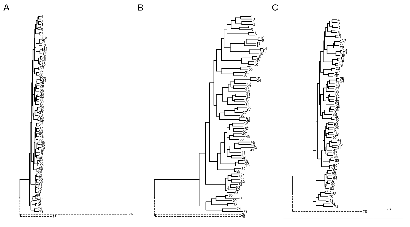
FIGURE A.8: Shrink outlier long branch. Original tree (A); reduced outgroup branch length (B); truncated tree plot (C).
A.5.4 Attach a new tip to a tree
Sometimes there are known branches that are not in the tree, but we would like to have them on the tree. Another common scenario is when we have a new sequence species and would like to update the reference tree with this species by inferring its evolutionary position.
Users can use phytools::bind.tip() (Revell, 2012) to attach a new tip to a tree. With tidytree, it is easy to add an annotation to differentiate newly introduced and original branches and to reflect the uncertainty of the added branch splits off, as demonstrated in Figure A.9.
library(phytools)
library(tidytree)
library(ggplot2)
library(ggtree)

set.seed(2019-11-18)
tr <- rtree(5)

tr2 <- bind.tip(tr, 'U', edge.length = 0.1, where = 7, position=0.15)
d <- as_tibble(tr2)
d$type <- "original"
d$type[d$label == 'U'] <- 'newly introduced'
d$sd <- NA
d$sd[parent(d, 'U')$node] <- 0.05

tr3 <- as.treedata(d)
ggtree(tr3, aes(linetype=type)) +  geom_tiplab() +
  geom_errorbarh(aes(xmin=x-sd, xmax=x+sd, y = y - 0.3),
                linetype='dashed', height=0.1) +
  scale_linetype_manual(values = c("newly introduced" = "dashed",
                                   "original" = "solid")) +
theme(legend.position=c(.8, .2)) 
FIGURE A.9: Attaching a new tip to a tree. Different line types were employed to distinguish the newly introduced tip and an error bar was added to indicate the uncertainty of the added branch position.
A.5.5 Change colors or line types of arbitrarily selected branches
If you want to color or change line types of specific branches, you only need to prepare a data frame with variables of branch setting (e.g., selected and unselected). Applying the Method 1 described in (Yu et al., 2018) to map the data onto the tree will make it easy to set colors and line types (Figure A.10).
set.seed(123)
x <- rtree(10)
## binary choices of colors
d <- data.frame(node=1:Nnode2(x), colour = 'black')
d[c(2,3,14,15), 2] <- "red"

## multiple choices of line types
d2 <- data.frame(node=1:Nnode2(x), lty = 1)
d2[c(2,5,13, 14), 2] <- c(2, 3, 2,4)

p <- ggtree(x) + geom_label(aes(label=node))
p %<+% d %<+% d2 + aes(colour=I(colour), linetype=I(lty))
FIGURE A.10: Change colors and line types of specific branches.
Users can use the gginnards package to manipulate plot elements for more complicated scenarios.
A.5.6 Add an arbitrary point to a branch
If you want to add an arbitrary point to a branch23, you can use geom_nodepoint(), geom_tippoint(), or geom_point2() (works for both external and internal nodes) to filter selected node (the endpoint of the branch) via the subset aesthetic mapping and specify horizontal position by x = x - offset aesthetic mapping, where the offset can be an absolute value (Figure A.11A) or in proportion to the branch length (Figure A.11B).
set.seed(2020-05-20)
x <- rtree(10)
p <- ggtree(x)

p1 <- p + geom_nodepoint(aes(subset = node == 13, x = x - .1),
                        size = 5, colour = 'firebrick', shape = 21)

p2 <- p + geom_nodepoint(aes(subset = node == 13, x = x - branch.length * 0.2),
                        size = 3, colour = 'firebrick') +
       geom_nodepoint(aes(subset = node == 13, x = x - branch.length * 0.8),
                        size = 5, colour = 'steelblue')
plot_list(p1, p2, ncol=2, tag_levels="A")
FIGURE A.11: Add an arbitrary point on a branch. The position of the symbolic point can be adjusted by an absolute value (A) or in proportion to the branch length (B).
A.6 Different X-axis Labels for Different Facet Panels
This is not supported by ggplot2 in general. However, we can just draw text labels for each panel and put the labels beyond the plot panels as demonstrated in Figure A.12.
library(ggtree)
library(ggplot2)
set.seed(2019-05-02)
x <- rtree(30)
p <- ggtree(x) + geom_tiplab()
d <- data.frame(label = x$tip.label,
                value = rnorm(30))
p2 <- p + geom_facet(panel = "Dot", data = d,
            geom = geom_point, mapping = aes(x = value))

p2 <- p2 + theme_bw() +
    xlim_tree(5) + xlim_expand(c(-5, 5), 'Dot')

# .panel is the internal variable used in `geom_facet` for faceting.
d <- data.frame(.panel = c('Tree', 'Dot'),
                lab = c("Distance", "Dot Units"),
                x=c(2.5,0), y=-2)

p2 + scale_y_continuous(limits=c(0, 31),
                        expand=c(0,0),
                        oob=function(x, ...) x) +
    geom_text(aes(label=lab), data=d) +
    coord_cartesian(clip='off')  +
    theme(plot.margin=margin(6, 6, 40, 6))
FIGURE A.12: X-axis titles for different facet panels.
A.7 Plot Something behind the Phylogeny
The ggtree() function plots the tree structure, and normally we add layers on top of the tree.
set.seed(1982)
x <- rtree(5)
p <- ggtree(x) + geom_hilight(node=7, alpha=1)
If we want the layers behind the tree layer, we can reverse the order of all the layers.
p$layers <- rev(p$layers)Another solution is to use ggplot() instead of ggtree() and + geom_tree() to add the layer of tree structure at the correct position of the layer stack (Figure A.13).
ggplot(x) + geom_hilight(node=7, alpha=1) + geom_tree() + theme_tree() 
FIGURE A.13: Add layers behind the tree structure. A layer on top of the tree structure (A). Reverse layer order of A (B). Add layer behind the tree layer (C).
A.8 Enlarge Center Space in Circular/Fan Layout Tree
This question for enlarging center space in circular/fan layout tree was asked several times24, and a published example can be found in (Barton et al., 2016). Increasing the percentage of center white space in a circular tree is useful to avoid overlapping tip labels and to increase the readability of the tree by moving all nodes and branches further out. This can be done simply by using xlim() or hexpand() to allocate more space (Figure A.14A), just like in Figure 4.3G, or assigning a long root branch that is similar to the “Root Length” parameter in FigTree (Figure A.14B).
set.seed(1982)
tree <- rtree(30)
plot_list(
  ggtree(tree, layout='circular') + xlim(-10, NA),
  ggtree(tree, layout='circular') + geom_rootedge(5),
  tag_levels = "A", ncol=2
)
FIGURE A.14: Enlarge center space in circular tree. Allocate more space by xlim (A) or long root branch (B).
A.9 Use the Most Distant Tip from the Root as the Origin of the Timescale
The revts() will reverse the x-axis by setting the most recent tip to 0. We can use scale_x_continuous(labels=abs) to label x-axis using absolute values (Figure A.15).
tr <- rtree(10)
p <- ggtree(tr) + theme_tree2()
p2 <- revts(p) + scale_x_continuous(labels=abs)
plot_list(p, p2, ncol=2, tag_levels="A")
FIGURE A.15: Origin of the time scale. Forward: from the root to the tips (A). Backward: from the most distant tip to the root (B).
A.10 Remove Blank Margins for Circular Layout Tree
For plots in polar coordinates, such as a circular layout tree, it is very common that extra spaces will be generated.
If you are using Rmarkdown, you can set the following options for knitr to remove extra white space automatically.
Otherwise, we can use command-line tools to remove extra white space:
## for pdf
pdfcrop x.pdf

## for png
convert -trim x.png x-crop.png
If you want to do it in R, you can use the magick package:
library(magick)

x <- image_read("x.png")
## x <- image_read_pdf("x.pdf") # for PDF

image_trim(x)
Here is an example (Figure A.16):
library(ggplot2)
library(ggtree)
library(patchwork)
library(magick)

set.seed(2021)
tr <- rtree(30)
p <- ggtree(tr, size=1, colour="purple", layout='circular')

f <- tempfile(fileext=".png")
ggsave(filename = f, plot = p, width=7, height=7)

x <- image_read(f, density=300)
y <- image_trim(x)

panel_border <- theme(panel.border=element_rect(colour='black',
                                            fill=NA, size=2))
xx <- image_ggplot(x) + panel_border
yy <- image_ggplot(y) + panel_border

plot_list(xx, yy, tag_levels = "A", ncol=2)
FIGURE A.16: Trim extra white space for polar coordinates. Original plot (A). Trimmed version (B).