13 Gallery of Reproducible Examples
13.1 Visualizing pairwise nucleotide sequence distance with a phylogenetic tree
This example reproduces figure 1 of (Chen et al., 2017). It extracts accession numbers from tip labels of the HPV58 tree and calculates pairwise nucleotide sequence distances. The distance matrix is visualized as dot and line plots. This example demonstrates the ability to add multiple layers to a specific panel. As illustrated in Figure 13.1, the geom_facet() function displays sequence distances as a dot plot and then adds a layer of line plot to the same panel, i.e., sequence distance. In addition, the tree in geom_facet() can be fully annotated with multiple layers (clade labels, bootstrap support values, etc.). The source code is modified from the supplemental file of (Yu et al., 2018).
library(TDbook)
library(tibble)
library(tidyr)
library(Biostrings)
library(treeio)
library(ggplot2)
library(ggtree)

# loaded from TDbook package
tree <- tree_HPV58

clade <- c(A3 = 92, A1 = 94, A2 = 108, B1 = 156,
            B2 = 159, C = 163, D1 = 173, D2 = 176)
tree <- groupClade(tree, clade)
cols <- c(A1 = "#EC762F", A2 = "#CA6629", A3 = "#894418", B1 = "#0923FA",
         B2 = "#020D87", C = "#000000", D1 = "#9ACD32",D2 = "#08630A")

## visualize the tree with tip labels and tree scale
p <- ggtree(tree, aes(color = group), ladderize = FALSE) %>%
    rotate(rootnode(tree)) +
    geom_tiplab(aes(label = paste0("italic('", label, "')")),
                parse = TRUE, size = 2.5) +
    geom_treescale(x = 0, y = 1, width = 0.002) +
    scale_color_manual(values = c(cols, "black"),
                na.value = "black", name = "Lineage",
                breaks = c("A1", "A2", "A3", "B1", "B2", "C", "D1", "D2")) +
    guides(color = guide_legend(override.aes = list(size = 5, shape = 15))) +
    theme_tree2(legend.position = c(.1, .88))
## Optional
## add labels for monophyletic (A, C and D) and paraphyletic (B) groups
dat <- tibble(node = c(94, 108, 131, 92, 156, 159, 163, 173, 176,172),
              name = c("A1", "A2", "A3", "A", "B1",
                        "B2", "C", "D1", "D2", "D"),
              offset = c(0.003, 0.003, 0.003, 0.00315, 0.003,
                        0.003, 0.0031, 0.003, 0.003, 0.00315),
              offset.text = c(-.001, -.001, -.001, 0.0002, -.001,
                        -.001, 0.0002, -.001, -.001, 0.0002),
              barsize = c(1.2, 1.2, 1.2, 2, 1.2, 1.2, 3.2, 1.2, 1.2, 2),
              extend = list(c(0, 0.5), 0.5, c(0.5, 0), 0, c(0, 0.5),
                        c(0.5, 0), 0, c(0, 0.5), c(0.5, 0), 0)
            ) %>%
       dplyr::group_split(barsize)

p <- p +
     geom_cladelab(
         data = dat[[1]],
         mapping = aes(
             node = node,
             label = name,
             color = group,
             offset = offset,
             offset.text = offset.text,
             extend = extend
         ),
         barsize = 1.2,
         fontface = 3,
         align = TRUE
     ) +
     geom_cladelab(
         data = dat[[2]],
         mapping = aes(
             node = node,
             label = name,
             offset = offset,
             offset.text =offset.text,
             extend = extend
         ),
         barcolor = "darkgrey",
         textcolor = "darkgrey",
         barsize = 2,
         fontsize = 5,
         fontface = 3,
         align = TRUE
     ) +
     geom_cladelab(
         data = dat[[3]],
         mapping = aes(
             node = node,
             label = name,
             offset = offset,
             offset.text = offset.text,
             extend = extend
         ),
         barcolor = "darkgrey",
         textcolor = "darkgrey",
         barsize = 3.2,
         fontsize = 5,
         fontface = 3,
         align = TRUE
     ) +
     geom_strip(65, 71, "italic(B)", color = "darkgrey",
                offset = 0.00315, align = TRUE, offset.text = 0.0002,
                barsize = 2, fontsize = 5, parse = TRUE)

## Optional
## display support values
p <- p + geom_nodelab(aes(subset = (node == 92), label = "*"),
                    color = "black", nudge_x = -.001, nudge_y = 1) +
    geom_nodelab(aes(subset = (node == 155), label = "*"),
                    color = "black", nudge_x = -.0003, nudge_y = -1) +
    geom_nodelab(aes(subset = (node == 158), label = "95/92/1.00"),
                    color = "black", nudge_x = -0.0001,
                    nudge_y = -1, hjust = 1) +
    geom_nodelab(aes(subset = (node == 162), label = "98/97/1.00"),
                    color = "black", nudge_x = -0.0001,
                    nudge_y = -1, hjust = 1) +
    geom_nodelab(aes(subset = (node == 172), label = "*"),
                    color = "black", nudge_x = -.0003, nudge_y = -1)
## extract accession numbers from tip labels
tl <- tree$tip.label
acc <- sub("\\w+\\|", "", tl)
names(tl) <- acc

## read sequences from GenBank directly into R
## and convert the object to DNAStringSet
tipseq <- ape::read.GenBank(acc) %>% as.character %>%
    lapply(., paste0, collapse = "") %>% unlist %>%
    DNAStringSet
## align the sequences using muscle
tipseq_aln <- muscle::muscle(tipseq)
tipseq_aln <- DNAStringSet(tipseq_aln)
## calculate pairwise hamming distances among sequences
tipseq_dist <- stringDist(tipseq_aln, method = "hamming")

## calculate the percentage of differences
tipseq_d <- as.matrix(tipseq_dist) / width(tipseq_aln[1]) * 100

## convert the matrix to a tidy data frame for facet_plot
dd <- as_tibble(tipseq_d)
dd$seq1 <- rownames(tipseq_d)
td <- gather(dd,seq2, dist, -seq1)
td$seq1 <- tl[td$seq1]
td$seq2 <- tl[td$seq2]

g <- p$data$group
names(g) <- p$data$label
td$clade <- g[td$seq2]

## visualize the sequence differences using dot plot and line plot
## and align the sequence difference plot to the tree using facet_plot
p2 <- p + geom_facet(panel = "Sequence Distance",
            data = td, geom = geom_point, alpha = .6,
            mapping = aes(x = dist, color = clade, shape = clade)) +
    geom_facet(panel = "Sequence Distance",
            data = td, geom = geom_path, alpha = .6,
            mapping=aes(x = dist, group = seq2, color = clade)) +
    scale_shape_manual(values = 1:8, guide = FALSE)

print(p2)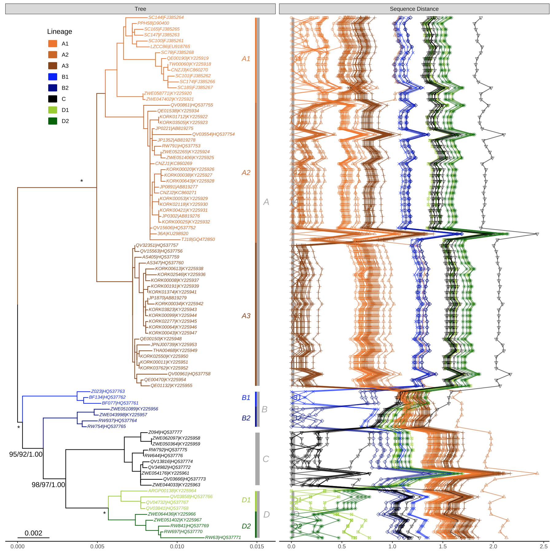
FIGURE 13.1: Phylogeny of HPV58 complete genomes with dot and line plots of pairwise nucleotide sequence distances.
13.2 Displaying Different Symbolic Points for Bootstrap Values.
We can cut the bootstrap values into several intervals, e.g., to indicate whether the clade is of high, moderate, or low support. Then we can use these intervals as categorical variables to set different colors or shapes of symbolic points to indicate the bootstrap values belong to which category (Figure 13.2).
library(treeio)
library(ggplot2)
library(ggtree)
library(TDbook)

tree <- read.newick(text=text_RMI_tree, node.label = "support")
root <- rootnode(tree)
ggtree(tree, color="black", size=1.5, linetype=1,  right=TRUE) +
    geom_tiplab(size=4.5, hjust = -0.060, fontface="bold") +  xlim(0, 0.09) +
    geom_point2(aes(subset=!isTip & node != root,
                    fill=cut(support, c(0, 700, 900, 1000))),
                    shape=21, size=4) +
    theme_tree(legend.position=c(0.2, 0.2)) +
    scale_fill_manual(values=c("white", "grey", "black"), guide='legend',
                    name='Bootstrap Percentage(BP)',
                    breaks=c('(900,1e+03]', '(700,900]', '(0,700]'),
                    labels=expression(BP>=90,70 <= BP * " < 90", BP < 70))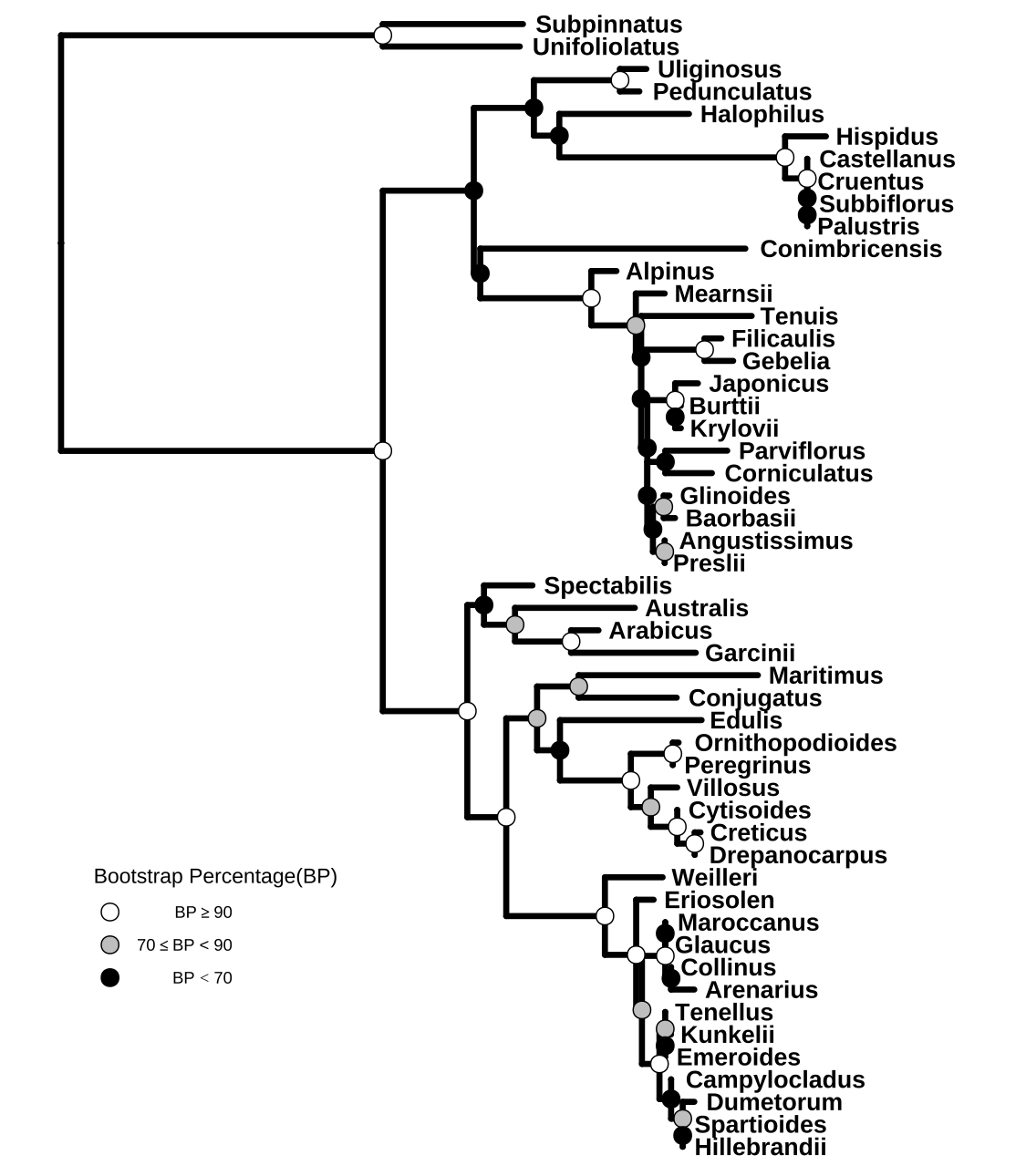
FIGURE 13.2: Partitioning bootstrap values. Bootstrap values were divided into three categories and this information was used to color circle points.
13.3 Highlighting Different Groups
This example reproduces Figure 1 of (Larsen et al., 2019). It used groupOTU() to add grouping information of chicken CTLDcps. The branch line type and color are defined based on this grouping information. Two groups of CTLDcps are highlighted in different background colors using geom_hilight (red for Group II and green for Group V). The avian-specific expansion of Group V with the subgroups of A and B- are labeled using geom_cladelab (Figure 13.3).
library(TDbook)
mytree <- tree_treenwk_30.4.19

# Define nodes for coloring later on
tiplab <- mytree$tip.label
cls <- tiplab[grep("^ch", tiplab)]
labeltree <- groupOTU(mytree, cls)

p <- ggtree(labeltree, aes(color=group, linetype=group), layout="circular") +
    scale_color_manual(values = c("#efad29", "#63bbd4")) +
    geom_nodepoint(color="black", size=0.1) +
    geom_tiplab(size=2, color="black")

p2 <- flip(p, 136, 110) %>%
    flip(141, 145) %>%
    rotate(141) %>%
    rotate(142) %>%
    rotate(160) %>%
    rotate(164) %>%
    rotate(131)

### Group V and II coloring
dat <- data.frame(
           node = c(110, 88, 156,136),
           fill = c("#229f8a", "#229f8a", "#229f8a", "#f9311f")
       )
p3 <- p2 +
      geom_hilight(
          data = dat,
          mapping = aes(
              node = node,
              fill = I(fill)
          ),
          alpha = 0.2,
          extendto = 1.4
      )

### Putting on a label on the avian specific expansion
p4 <- p3 +
      geom_cladelab(
          node = 113,
          label = "Avian-specific expansion",
          align = TRUE,
          angle = -35,
          offset.text = 0.05,
          hjust = "center",
          fontsize = 2,
          offset = .2,
          barsize = .2
      )

### Adding the bootstrap values with subset used to remove all bootstraps < 50
p5 <- p4 +
      geom_nodelab(
          mapping = aes(
              x = branch,
              label = label,
              subset = !is.na(as.numeric(label)) & as.numeric(label) > 50
          ),
          size = 2,
          color = "black",
          nudge_y = 0.6
      )

### Putting labels on the subgroups
p6 <- p5 +
      geom_cladelab(
          data = data.frame(
              node = c(114, 121),
              name = c("Subgroup A", "Subgroup B")
          ),
          mapping = aes(
              node = node,
              label = name
          ),
          align = TRUE,
          offset = .05,
          offset.text = .03,
          hjust = "center",
          barsize = .2,
          fontsize = 2,
          angle = "auto",
          horizontal = FALSE
      ) +
      theme(
          legend.position = "none",
          plot.margin = grid::unit(c(-15, -15, -15, -15), "mm")
      )
print(p6)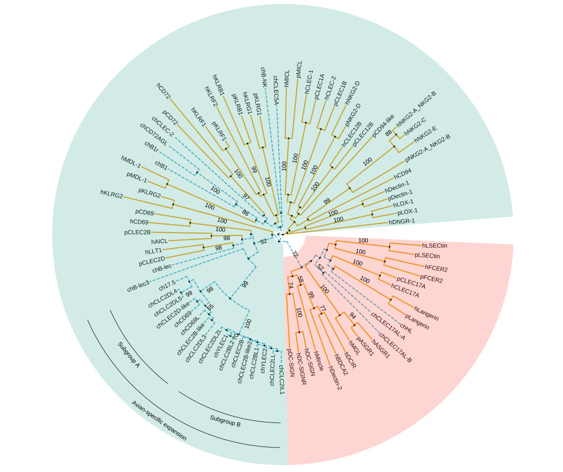
FIGURE 13.3: Phylogenetic tree of CTLDcps. Using different background colors, line types and colors, and clade labels to distinguish groups.
13.4 Phylogenetic Tree with Genome Locus Structure
The geom_motif() is defined in ggtree and it is a wrapper layer of the gggenes::geom_gene_arrow(). The geom_motif() can automatically adjust genomic alignment by selective gene (via the on parameter) and can label genes via the label parameter. In the following example, we use example_genes dataset provided by gggenes. As the dataset only provides genomic coordination of a set of genes, a phylogeny for the genomes needs to be constructed first. We calculate Jaccard similarity based on the ratio of overlapping genes among genomes and correspondingly determine genome distance. The BioNJ algorithm was applied to construct the tree. Then we can use geom_facet() to visualize the tree with the genomic structures (Figure 13.4).
library(dplyr)
library(ggplot2)
library(gggenes)
library(ggtree)

get_genes <- function(data, genome) {
    filter(data, molecule == genome) %>% pull(gene)
}

g <- unique(example_genes[,1])
n <- length(g)
d <- matrix(nrow = n, ncol = n)
rownames(d) <- colnames(d) <- g
genes <- lapply(g, get_genes, data = example_genes)

for (i in 1:n) {
    for (j in 1:i) {
        jaccard_sim <- length(intersect(genes[[i]], genes[[j]])) /
                       length(union(genes[[i]], genes[[j]]))
        d[j, i] <- d[i, j] <- 1 - jaccard_sim
    }
}

tree <- ape::bionj(d)

p <- ggtree(tree, branch.length='none') +
    geom_tiplab() + xlim_tree(5.5) +
    geom_facet(mapping = aes(xmin = start, xmax = end, fill = gene),
               data = example_genes, geom = geom_motif, panel = 'Alignment',
               on = 'genE', label = 'gene', align = 'left') +
    scale_fill_brewer(palette = "Set3") +
    scale_x_continuous(expand=c(0,0)) +
    theme(strip.text=element_blank(),
        panel.spacing=unit(0, 'cm'))

facet_widths(p, widths=c(1,2))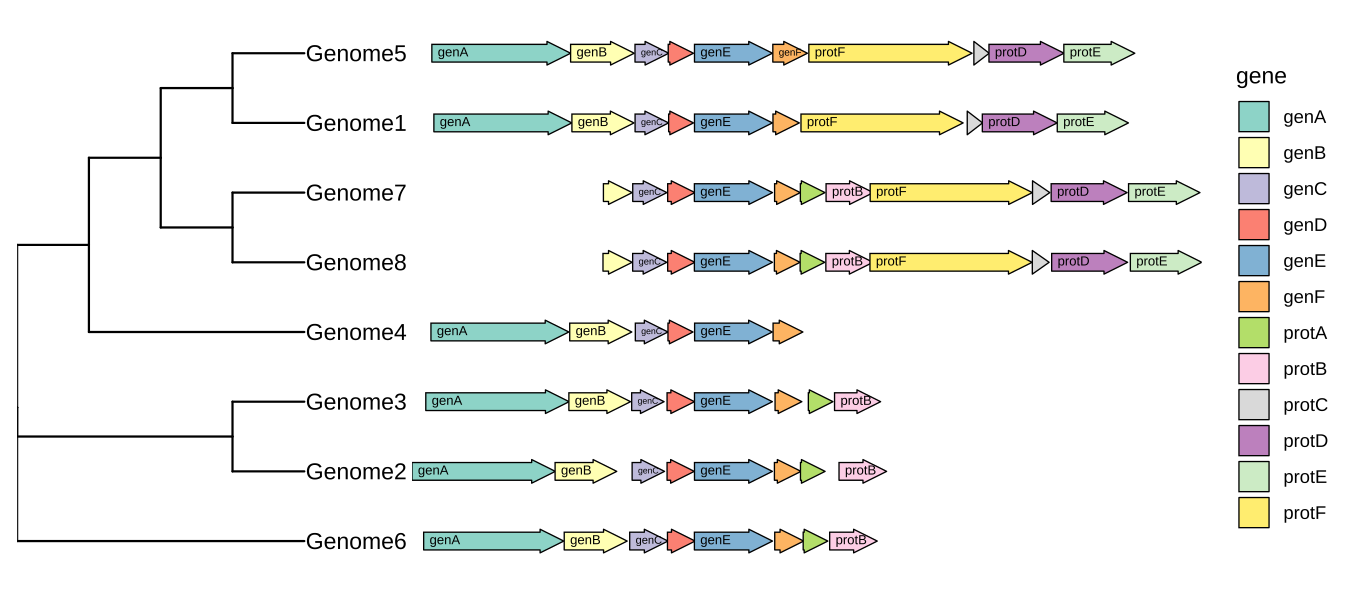
FIGURE 13.4: Genomic features with a phylogenetic tree.