10 ggtreeExtra for Presenting Data on a Circular Layout
10.1 Introduction
The ggtree package (Yu et al., 2017) provides programmable visualization and annotation of phylogenetic trees and other tree-like structures. It supports visualizing tree data in multiple layers or with the tree side-by-side (see also Chapter 7 and (Yu et al., 2018)). Although ggtree supports many layouts, the geom_facet() layer only works with rectangular, roundrect, ellipse, and slanted layouts to present tree data on different panels. There is no direct support in ggtree to present data on the outer rings of a tree in circular, fan, and radial layouts. To solve this issue, we developed the ggtreeExtra package, which allows users to align associated graph layers in outer rings of circular layout tree. In addition, it also works with a rectangular tree layout (Figure 10.3).
10.2 Aligning Graphs to the Tree Based on a Tree Structure
The ggtreeExtra package provides a layer function, geom_fruit(), to align graphs with the tree side-by-side. Similar to the geom_facet() layout described in Chapter 7, geom_fruit() internally re-orders the input data based on the tree structure and visualizes the data using a specified geometric layer function with user-provided aesthetic mapping and non-variable setting. The graph will be displayed on the outer ring of the tree.
The geom_fruit() is designed to work with most geom layers defined in ggplot2 and its extensions. The position of the graph (i.e., on the outer ring) is controlled by the position parameter, which accepts a Position object. The default value of the position parameter is ‘auto’ and the geom_fruit() layer will guess and determine (hopefully) a suitable position for the specified geometric layer. That means using position_stackx() for geom_bar(), position_dodgex() for geom_violin() and geom_boxplot(), and position_identityx() for others (e.g., geom_point(), geom_tile(), etc.). A geometric layer that has a position parameter should be compatible with geom_fruit(), as it allows using position functions defined in the ggtreeExtra package to adjust output layer positions. Besides, the geom_fruit() layer allows setting axis and background grid lines for the current layer using the axis.params and grid.params parameters, respectively.
The following example uses microbiome data provided in the phyloseq package and a boxplot is employed to visualize species abundance data. The geom_fruit() layer automatically rearranges the abundance data according to the circular tree structure and visualizes the data using the specific geom function (i.e., geom_boxplot()). Visualizing this dataset using geom_density_ridges() with geom_facet() can be found in figure 1 of (Yu et al., 2018).
library(ggtreeExtra)
library(ggtree)
library(phyloseq)
library(dplyr)

data("GlobalPatterns")
GP <- GlobalPatterns
GP <- prune_taxa(taxa_sums(GP) > 600, GP)
sample_data(GP)$human <- get_variable(GP, "SampleType") %in%
                              c("Feces", "Skin")
mergedGP <- merge_samples(GP, "SampleType")
mergedGP <- rarefy_even_depth(mergedGP,rngseed=394582)
mergedGP <- tax_glom(mergedGP,"Order")

melt_simple <- psmelt(mergedGP) %>%
               filter(Abundance < 120) %>%
               select(OTU, val=Abundance)

p <- ggtree(mergedGP, layout="fan", open.angle=10) +
     geom_tippoint(mapping=aes(color=Phylum),
                   size=1.5,
                   show.legend=FALSE)
p <- rotate_tree(p, -90)

p <- p +
     geom_fruit(
         data=melt_simple,
         geom=geom_boxplot,
         mapping = aes(
                     y=OTU,
                     x=val,
                     group=label,
                     fill=Phylum,
                   ),
         size=.2,
         outlier.size=0.5,
         outlier.stroke=0.08,
         outlier.shape=21,
         axis.params=list(
                         axis       = "x",
                         text.size  = 1.8,
                         hjust      = 1,
                         vjust      = 0.5,
                         nbreak     = 3,
                     ),
         grid.params=list()
     )

p <- p +
     scale_fill_discrete(
         name="Phyla",
         guide=guide_legend(keywidth=0.8, keyheight=0.8, ncol=1)
     ) +
     theme(
         legend.title=element_text(size=9),
         legend.text=element_text(size=7)
     )
p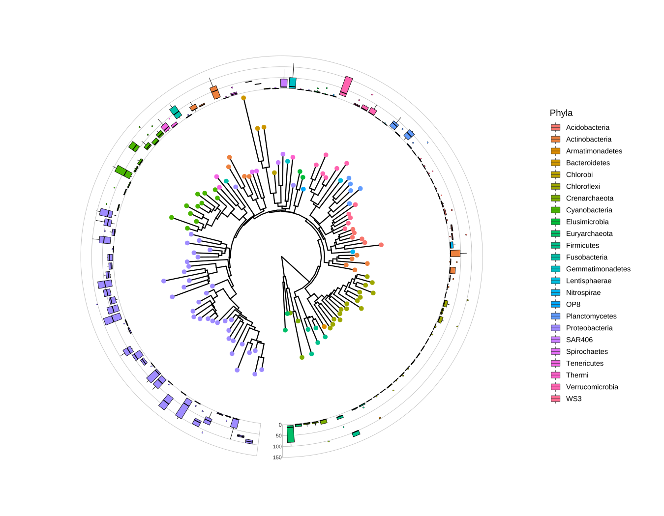
FIGURE 10.1: Phylogenetic tree with OTU abundance distribution. Species abundance distribution was aligned to the tree and visualized as boxplots. The Phylum information was used to color symbolic points on the tree and also species abundance distributions.
10.3 Aligning Multiple Graphs to the Tree for Multi-dimensional Data
We are able to add multiple geom_fruit() layers to a tree and the circular layout is indeed more compact and efficient for multi-dimensional data. This example reproduces figure 2 of (Morgan et al., 2013). The data is provided by GraPhlAn (Asnicar et al., 2015), which contained the relative abundance of the microbiome at different body sites. This example demonstrates the ability to add multiple layers (heat map and bar plot) to present different types of data (Figure 10.2).
library(ggtreeExtra)
library(ggtree)
library(treeio)
library(tidytree)
library(ggstar)
library(ggplot2)
library(ggnewscale)
library(TDbook)

# load data from TDbook, including tree_hmptree,
# df_tippoint (the abundance and types of microbes),
# df_ring_heatmap (the abundance of microbes at different body sites),
# and df_barplot_attr (the abundance of microbes of greatest prevalence)
tree <- tree_hmptree
dat1 <- df_tippoint
dat2 <- df_ring_heatmap
dat3 <- df_barplot_attr

# adjust the order
dat2$Sites <- factor(dat2$Sites,
                    levels=c("Stool (prevalence)", "Cheek (prevalence)",
                             "Plaque (prevalence)","Tongue (prevalence)",
                             "Nose (prevalence)", "Vagina (prevalence)",
                             "Skin (prevalence)"))
dat3$Sites <- factor(dat3$Sites,
                    levels=c("Stool (prevalence)", "Cheek (prevalence)",
                             "Plaque (prevalence)", "Tongue (prevalence)",
                             "Nose (prevalence)", "Vagina (prevalence)",
                             "Skin (prevalence)"))
# extract the clade label information. Because some nodes of tree are
# annotated to genera, which can be displayed with high light using ggtree.
nodeids <- nodeid(tree, tree$node.label[nchar(tree$node.label)>4])
nodedf <- data.frame(node=nodeids)
nodelab <- gsub("[\\.0-9]", "", tree$node.label[nchar(tree$node.label)>4])
# The layers of clade and hightlight
poslist <- c(1.6, 1.4, 1.6, 0.8, 0.1, 0.25, 1.6, 1.6, 1.2, 0.4,
             1.2, 1.8, 0.3, 0.8, 0.4, 0.3, 0.4, 0.4, 0.4, 0.6,
             0.3, 0.4, 0.3)
labdf <- data.frame(node=nodeids, label=nodelab, pos=poslist)

# The circular layout tree.
p <- ggtree(tree, layout="fan", size=0.15, open.angle=5) +
     geom_hilight(data=nodedf, mapping=aes(node=node),
                  extendto=6.8, alpha=0.3, fill="grey", color="grey50",
                  size=0.05) +
     geom_cladelab(data=labdf,
                   mapping=aes(node=node,
                               label=label,
                               offset.text=pos),
                   hjust=0.5,
                   angle="auto",
                   barsize=NA,
                   horizontal=FALSE,
                   fontsize=1.4,
                   fontface="italic"
                   )

p <- p %<+% dat1 + geom_star(
                        mapping=aes(fill=Phylum, starshape=Type, size=Size),
                        position="identity",starstroke=0.1) +
        scale_fill_manual(values=c("#FFC125","#87CEFA","#7B68EE","#808080",
                                "#800080", "#9ACD32","#D15FEE","#FFC0CB",
                                "#EE6A50","#8DEEEE", "#006400","#800000",
                                "#B0171F","#191970"),
                           guide=guide_legend(keywidth = 0.5,
                                        keyheight = 0.5, order=1,
                                        override.aes=list(starshape=15)),
                           na.translate=FALSE)+
        scale_starshape_manual(values=c(15, 1),
                           guide=guide_legend(keywidth = 0.5,
                                        keyheight = 0.5, order=2),
                           na.translate=FALSE)+
        scale_size_continuous(range = c(1, 2.5),
                           guide = guide_legend(keywidth = 0.5,
                                        keyheight = 0.5, order=3,
                                        override.aes=list(starshape=15)))

p <- p + new_scale_fill() +
         geom_fruit(data=dat2, geom=geom_tile,
                  mapping=aes(y=ID, x=Sites, alpha=Abundance, fill=Sites),
                  color = "grey50", offset = 0.04,size = 0.02)+
         scale_alpha_continuous(range=c(0, 1),
                             guide=guide_legend(keywidth = 0.3,
                                             keyheight = 0.3, order=5)) +
         geom_fruit(data=dat3, geom=geom_bar,
                    mapping=aes(y=ID, x=HigherAbundance, fill=Sites),
                    pwidth=0.38,
                    orientation="y",
                    stat="identity",
         ) +
         scale_fill_manual(values=c("#0000FF","#FFA500","#FF0000",
                                "#800000", "#006400","#800080","#696969"),
                           guide=guide_legend(keywidth = 0.3,
                                        keyheight = 0.3, order=4))+
         geom_treescale(fontsize=2, linesize=0.3, x=4.9, y=0.1) +
         theme(legend.position=c(0.93, 0.5),
               legend.background=element_rect(fill=NA),
               legend.title=element_text(size=6.5),
               legend.text=element_text(size=4.5),
               legend.spacing.y = unit(0.02, "cm"),
             )
p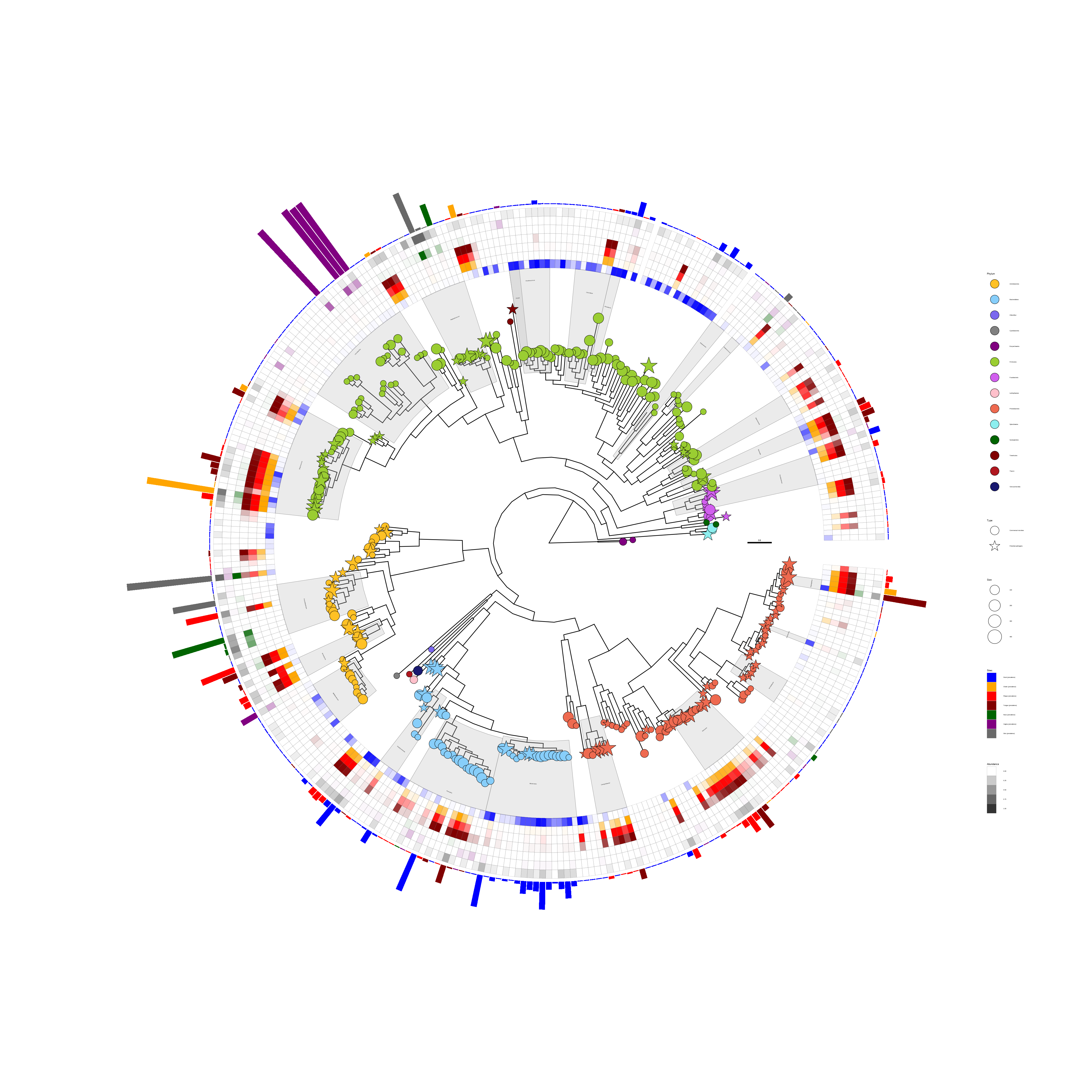
FIGURE 10.2: Presenting microbiome data (abundance and location) on a phylogenetic tree. The tree was annotated with symbolic points, highlighted clades, and clade labels. Two geom_fruit() layers were used to visualize location and abundance information.
The shape of the tip points indicates the types of microbes (commensal microbes or potential pathogens). The transparency of the heatmap indicates the abundance of the microbes, and the colors of the heatmap indicate different sites of the human body. The bar plot indicates the relative abundance of the most prevalent species at the body sites. The node labels contain taxonomy information in this example, and the information was used to highlight and label corresponding clades using geom_hilight() and geom_cladelab(), respectively.
The geom_fruit() layer supports rectangular layout. Users can either add a geom_fruit() layer to a rectangular tree (e.g., ggtree(tree_object) + geom_fruit(...)) or use layout_rectangular() to transform a circular layout tree to a rectangular layout tree as demonstrated in Figure 10.3.
p + layout_rectangular() +
    theme(legend.position=c(.05, .7))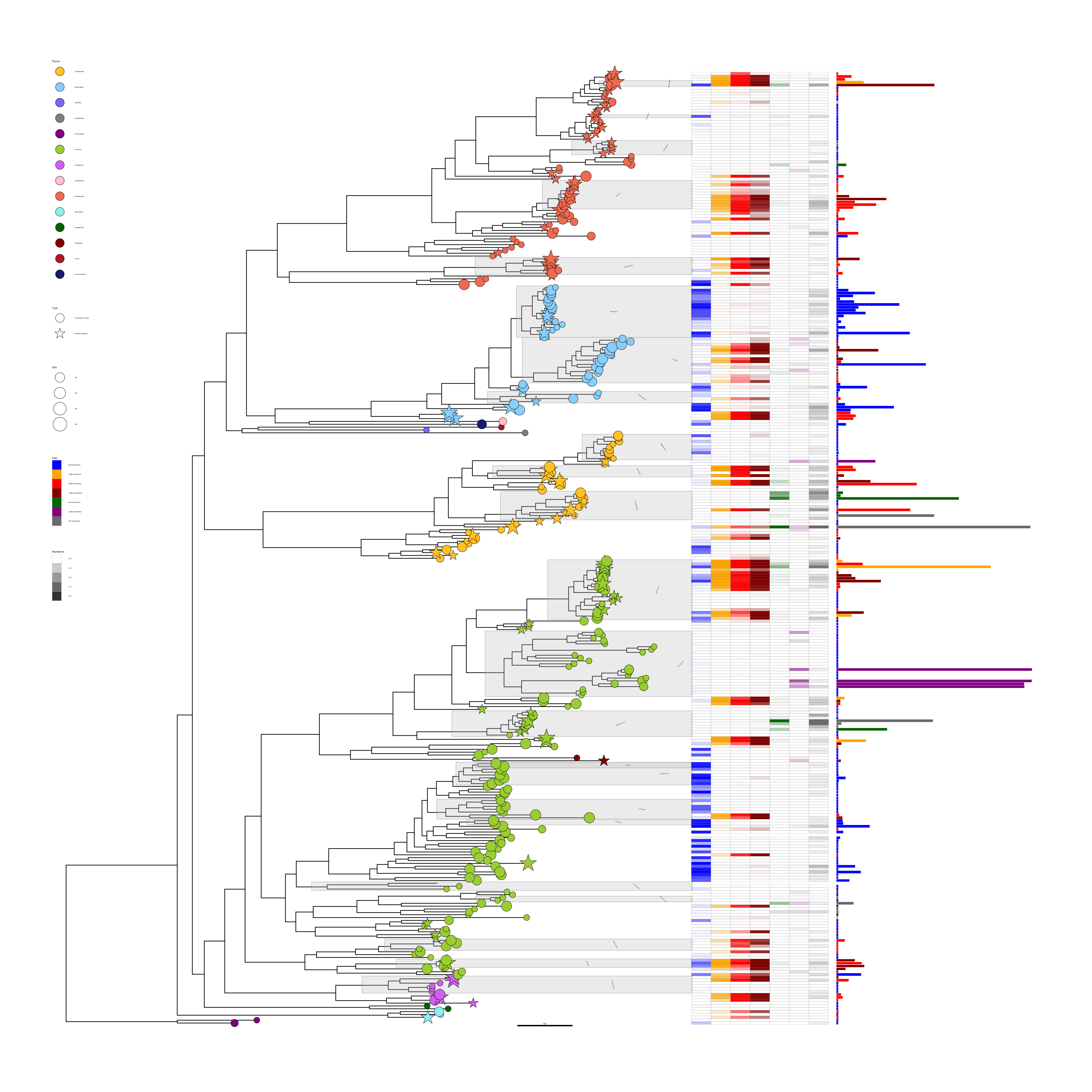
FIGURE 10.3: Illustration of using geom_fruit() in rectangular tree layout. The figure was produced by transforming Figure 10.2 using the rectangular layout. Transforming a rectangular layout tree to a circular layout tree is also supported.
10.4 Examples for Population Genetics
The ggtree (Yu et al., 2017) and ggtreeExtra packages are designed as general tools and can be applied to many research fields, such as infectious disease epidemiology, metagenome, population genetics, evolutionary biology, and ecology. We have introduced examples for metagenome research (Figure 10.1 and Figure 10.2). In this session, we present examples for population genetics by reproducing figure 4 of (Chow et al., 2020) and figure 1 of (Wong et al., 2015).
library(ggtree)
library(ggtreeExtra)
library(ggplot2)
library(ggnewscale)
library(reshape2)
library(dplyr)
library(tidytree)
library(ggstar)
library(TDbook)

# load tr and dat from the TDbook package
dat <- df_Candidaauris_data
tr <- tree_Candidaauris

countries <- c("Canada", "United States",
               "Colombia", "Panama",
               "Venezuela", "France",
               "Germany", "Spain",
               "UK", "India",
               "Israel", "Pakistan",
               "Saudi Arabia", "United Arab Emirates",
               "Kenya", "South Africa",
               "Japan", "South Korea",
               "Australia")
# For the tip points
dat1 <- dat %>% select(c("ID", "COUNTRY", "COUNTRY__colour"))
dat1$COUNTRY <- factor(dat1$COUNTRY, levels=countries)
COUNTRYcolors <- dat1[match(countries,dat$COUNTRY),"COUNTRY__colour"]

# For the heatmap layer
dat2 <- dat %>% select(c("ID", "FCZ", "AMB", "MCF"))
dat2 <- melt(dat2,id="ID", variable.name="Antifungal", value.name="type")
dat2$type <- paste(dat2$Antifungal, dat2$type)
dat2$type[grepl("Not_", dat2$type)] = "Susceptible"
dat2$Antifungal <- factor(dat2$Antifungal, levels=c("FCZ", "AMB", "MCF"))
dat2$type <- factor(dat2$type,
                    levels=c("FCZ Resistant",
                            "AMB Resistant",
                            "MCF Resistant",
                            "Susceptible"))

# For the points layer
dat3 <- dat %>% select(c("ID", "ERG11", "FKS1")) %>%
        melt(id="ID", variable.name="point", value.name="mutation")
dat3$mutation <- paste(dat3$point, dat3$mutation)
dat3$mutation[grepl("WT", dat3$mutation)] <- NA
dat3$mutation <- factor(dat3$mutation,
                        levels=c("ERG11 Y132F", "ERG11 K143R",
                                 "ERG11 F126L", "FKS1 S639Y/P/F"))

# For the clade group
dat4 <- dat %>% select(c("ID", "CLADE"))
dat4 <- aggregate(.~CLADE, dat4, FUN=paste, collapse=",")
clades <- lapply(dat4$ID, function(x){unlist(strsplit(x,split=","))})
names(clades) <- dat4$CLADE

tr <- groupOTU(tr, clades, "Clade")
Clade <- NULL
p <- ggtree(tr=tr, layout="fan", open.angle=15, size=0.2, aes(colour=Clade)) +
     scale_colour_manual(
         values=c("black","#69B920","#9C2E88","#F74B00","#60C3DB"),
         labels=c("","I", "II", "III", "IV"),
         guide=guide_legend(keywidth=0.5,
                            keyheight=0.5,
                            order=1,
                            override.aes=list(linetype=c("0"=NA,
                                                         "Clade1"=1,
                                                         "Clade2"=1,
                                                         "Clade3"=1,
                                                         "Clade4"=1
                                                        )
                                             )
                           )
     ) +
     new_scale_colour()

p1 <- p %<+% dat1 +
     geom_tippoint(aes(colour=COUNTRY),
                   alpha=0) +
     geom_tiplab(aes(colour=COUNTRY),
                   align=TRUE,
                   linetype=3,
                   size=1,
                   linesize=0.2,
                   show.legend=FALSE
                   ) +
     scale_colour_manual(
         name="Country labels",
         values=COUNTRYcolors,
         guide=guide_legend(keywidth=0.5,
                            keyheight=0.5,
                            order=2,
                            override.aes=list(size=2,alpha=1))
     )

p2 <- p1 +
      geom_fruit(
          data=dat2,
          geom=geom_tile,
          mapping=aes(x=Antifungal, y=ID, fill=type),
          width=0.1,
          color="white",
          pwidth=0.1,
          offset=0.15
      ) +
      scale_fill_manual(
           name="Antifungal susceptibility",
           values=c("#595959", "#B30000", "#020099", "#E6E6E6"),
           na.translate=FALSE,
           guide=guide_legend(keywidth=0.5,
                              keyheight=0.5,
                              order=3
                             )
      ) +
      new_scale_fill()

p3 <- p2 +
      geom_fruit(
          data=dat3,
          geom=geom_star,
          mapping=aes(x=mutation, y=ID, fill=mutation, starshape=point),
          size=1,
          starstroke=0,
          pwidth=0.1,
          inherit.aes = FALSE,
          grid.params=list(
                          linetype=3,
                          size=0.2
                      )

      ) +
      scale_fill_manual(
          name="Point mutations",
          values=c("#329901", "#0600FF", "#FF0100", "#9900CC"),
          guide=guide_legend(keywidth=0.5, keyheight=0.5, order=4,
                             override.aes=list(
                                    starshape=c("ERG11 Y132F"=15,
                                                "ERG11 K143R"=15,
                                                "ERG11 F126L"=15,
                                                "FKS1 S639Y/P/F"=1),
                                    size=2)
                            ),
          na.translate=FALSE,
      ) +
      scale_starshape_manual(
          values=c(15, 1),
          guide="none"
      ) +
      theme(
          legend.background=element_rect(fill=NA),
          legend.title=element_text(size=7),
          legend.text=element_text(size=5.5),
          legend.spacing.y = unit(0.02, "cm")
      )
p3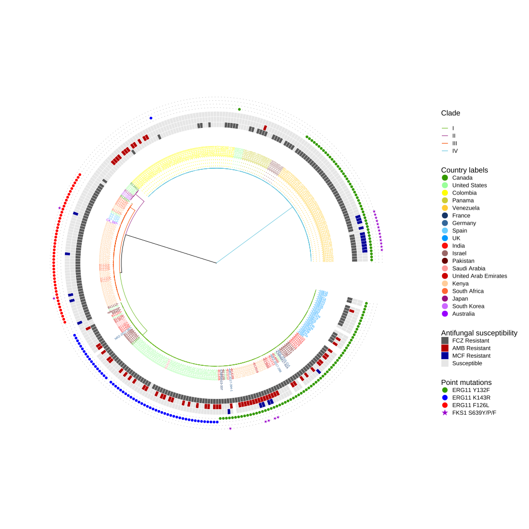
FIGURE 10.4: Antifungal susceptibility and point mutations in drug targets in Candida Auris .
In this example, Figure 10.4 shows the phylogenetic tree annotated with different colors to display different clades. The external heatmaps present the susceptibility to fluconazole (FCZ), amphotericin B (AMB), and micafungin (MCF). The external points display the point mutations in lanosterol 14-alpha-demethylase ERG11 (Y132F, K143R, and F126L) and beta-1,3-D-glucan synthase FKS1 (S639Y/P/F) associated with resistance (Chow et al., 2020).
library(ggtreeExtra)
library(ggtree)
library(ggplot2)
library(ggnewscale)
library(treeio)
library(tidytree)
library(dplyr)
library(ggstar)
library(TDbook)

# load tree_NJIDqgsS and df_NJIDqgsS from TDbook
tr <- tree_NJIDqgsS
metada <- df_NJIDqgsS
metadata <- metada %>%
            select(c("id", "country", "country__colour",
                    "year", "year__colour", "haplotype"))
metadata$haplotype[nchar(metadata$haplotype) == 0] <- NA

countrycolors <- metada %>%
                 select(c("country", "country__colour")) %>%
                 distinct()

yearcolors <- metada %>%
              select(c("year", "year__colour")) %>%
              distinct()
yearcolors <- yearcolors[order(yearcolors$year, decreasing=TRUE),]

metadata$country <- factor(metadata$country, levels=countrycolors$country)
metadata$year <- factor(metadata$year, levels=yearcolors$year)

p <- ggtree(tr, layout="fan", open.angle=15, size=0.1)

p <- p %<+% metadata

p1 <-p +
     geom_tippoint(
         mapping=aes(colour=country),
         size=1.5,
         stroke=0,
         alpha=0.4
     ) +
     scale_colour_manual(
         name="Country",
         values=countrycolors$country__colour,
         guide=guide_legend(keywidth=0.3,
                            keyheight=0.3,
                            ncol=2,
                            override.aes=list(size=2,alpha=1),
                            order=1)
     ) +
     theme(
         legend.title=element_text(size=5),
         legend.text=element_text(size=4),
         legend.spacing.y = unit(0.02, "cm")
     )

p2 <-p1 +
     geom_fruit(
         geom=geom_star,
         mapping=aes(fill=haplotype),
         starshape=26,
         color=NA,
         size=2,
         starstroke=0,
         offset=0,
     ) +
     scale_fill_manual(
         name="Haplotype",
         values=c("red"),
         guide=guide_legend(
                   keywidth=0.3,
                   keyheight=0.3,
                   order=3
               ),
         na.translate=FALSE
     )

p3 <-p2 +
     new_scale_fill() +
     geom_fruit(
         geom=geom_tile,
         mapping=aes(fill=year),
         width=0.002,
         offset=0.1
     ) +
     scale_fill_manual(
         name="Year",
         values=yearcolors$year__colour,
         guide=guide_legend(keywidth=0.3, keyheight=0.3, ncol=2, order=2)
     ) +
     theme(
           legend.title=element_text(size=6),
           legend.text=element_text(size=4.5),
           legend.spacing.y = unit(0.02, "cm")
           )
p3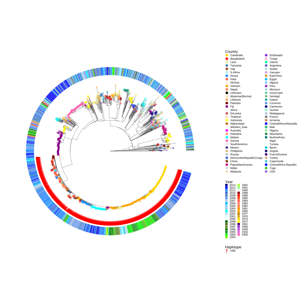
FIGURE 10.5: Population structure of the 1,832 S. Typhi isolates.
Figure 10.5 is a rooted maximum-likelihood tree of S. Typhi inferred from 22,145 SNPs (Wong et al., 2015), the colors of the tip points represent the geographical origin of the isolates, and the red symbolic points indicate the haplotype of H58 lineage. The color of the external heatmap indicates the years of isolation (Wong et al., 2015).
10.5 Summary
Compared to geom_facet(), geom_fruit() layer provided in ggtreeExtra is a better implementation of Method 2 proposed by (Yu et al., 2018). The geom_facet() and geom_fruit() have the same design philosophy and have a similar user interface. They rely on other geometric layers to visualize the tree-associated data. These dependent layers are provided by ggplot2 and its extension packages, including ggtree. As more and more layers are implemented by the ggplot2 community, the types of data and graphics that geom_facet() and geom_fruit() can present will also increase.