14 Biological theme comparison
The clusterProfiler package was developed for biological theme comparison (Yu et al. 2012; Wu et al. 2021), and it provides a function, compareCluster, to automatically calculate enriched functional profiles of each gene clusters and aggregate the results into a single object. Comparing functional profiles can reveal functional consensus and differences among different experiments and helps in identifying differential functional modules in omics datasets.
14.1 Comparing multiple gene lists
The compareCluster() function applies selected function (via the fun parameter) to perform enrichment analysis for each gene list.
## List of 8
##  $ X1: chr [1:216] "4597" "7111" "5266" "2175" ...
##  $ X2: chr [1:805] "23450" "5160" "7126" "26118" ...
##  $ X3: chr [1:392] "894" "7057" "22906" "3339" ...
##  $ X4: chr [1:838] "5573" "7453" "5245" "23450" ...
##  $ X5: chr [1:929] "5982" "7318" "6352" "2101" ...
##  $ X6: chr [1:585] "5337" "9295" "4035" "811" ...
##  $ X7: chr [1:582] "2621" "2665" "5690" "3608" ...
##  $ X8: chr [1:237] "2665" "4735" "1327" "3192" ...
Users can use a named list of gene IDs as the input that passed to the geneCluster parameter.
ck <- compareCluster(geneCluster = gcSample, fun = enrichKEGG)
ck <- setReadable(ck, OrgDb = org.Hs.eg.db, keyType="ENTREZID")
head(ck)
## Cluster ID Description GeneRatio BgRatio
## 1 X2 hsa04110 Cell cycle 18/386 126/8142
## 2 X2 hsa05169 Epstein-Barr virus infection 23/386 202/8142
## 3 X2 hsa05340 Primary immunodeficiency 8/386 38/8142
## 4 X3 hsa04512 ECM-receptor interaction 9/187 88/8142
## 5 X3 hsa04060 Cytokine-cytokine receptor interaction 17/187 295/8142
## 6 X3 hsa04151 PI3K-Akt signaling pathway 19/187 354/8142
## pvalue p.adjust qvalue
## 1 2.464433e-05 0.007590455 0.007107945
## 2 7.998698e-05 0.012317995 0.011534965
## 3 3.312476e-04 0.034008087 0.031846261
## 4 1.755273e-04 0.043142618 0.040385982
## 5 4.264497e-04 0.043142618 0.040385982
## 6 4.775936e-04 0.043142618 0.040385982
## geneID
## 1 CDC20/E2F1/CCNA2/E2F3/BUB1B/CDC6/DBF4/PKMYT1/CDC7/ESPL1/CCNE2/CDKN2A/SFN/BUB1/CHEK2/ORC6/CDC14B/MCM4
## 2 LYN/ICAM1/TNFAIP3/E2F1/CCNA2/E2F3/BAK1/RUNX3/BID/IKBKE/TAP2/FAS/CCNE2/RELB/CD3E/ENTPD3/SYK/TRAF3/IKBKB/CD247/NEDD4/CD40/STAT1
## 3 ADA/TAP2/LCK/CD79A/CD3E/CD8A/CD40/DCLRE1C
## 4 THBS1/HSPG2/COL9A3/ITGB7/CHAD/ITGA7/LAMA4/ITGB8/ITGB5
## 5 CXCL1/TNFRSF11B/LIFR/XCL1/GDF5/TNFRSF17/TNFRSF11A/IL5RA/EPOR/CSF2RA/TNFRSF25/BMP7/BMP4/GDF11/IL21R/IL23A/TGFB2
## 6 CCND2/THBS1/STK11/FGF2/COL9A3/ITGB7/FGF7/ERBB4/CHAD/FGF18/CDK6/PCK1/ITGA7/HGF/EPOR/LAMA4/IKBKB/ITGB8/ITGB5
## Count
## 1 18
## 2 23
## 3 8
## 4 9
## 5 17
## 6 1914.2 Formula interface of compareCluster
As an alternaitve to using named list, the compareCluster() function also supports passing a formula to describe more complicated experimental designs (e.g., \(Gene \sim time + treatment\)).
mydf <- data.frame(Entrez=names(geneList), FC=geneList)
mydf <- mydf[abs(mydf$FC) > 1,]
mydf$group <- "upregulated"
mydf$group[mydf$FC < 0] <- "downregulated"
mydf$othergroup <- "A"
mydf$othergroup[abs(mydf$FC) > 2] <- "B"

formula_res <- compareCluster(Entrez~group+othergroup, data=mydf, fun="enrichKEGG")

head(formula_res)
## Cluster group othergroup ID
## 1 downregulated.A downregulated A hsa04974
## 2 downregulated.A downregulated A hsa04510
## 3 downregulated.A downregulated A hsa04151
## 4 downregulated.A downregulated A hsa04512
## 5 downregulated.B downregulated B hsa03320
## 6 upregulated.A upregulated A hsa04110
## Description GeneRatio BgRatio pvalue p.adjust
## 1 Protein digestion and absorption 16/321 103/8142 2.332583e-06 6.531232e-04
## 2 Focal adhesion 20/321 201/8142 1.226205e-04 1.716687e-02
## 3 PI3K-Akt signaling pathway 28/321 354/8142 3.256458e-04 3.039361e-02
## 4 ECM-receptor interaction 11/321 88/8142 6.382523e-04 4.467766e-02
## 5 PPAR signaling pathway 5/43 75/8142 4.246461e-05 6.709409e-03
## 6 Cell cycle 20/220 126/8142 1.233602e-10 3.133350e-08
## qvalue
## 1 6.212037e-04
## 2 1.632788e-02
## 3 2.890820e-02
## 4 4.249417e-02
## 5 6.302643e-03
## 6 2.804822e-08
## geneID
## 1 1281/50509/1290/477/1294/1360/1289/1292/1296/23428/1359/1300/1287/6505/2006/7373
## 2 55742/2317/7058/25759/56034/3693/3480/5159/857/1292/3908/3909/63923/3913/1287/3679/7060/3479/10451/80310
## 3 55970/5618/7058/10161/56034/3693/4254/3480/4908/5159/1292/3908/2690/3909/8817/9223/4915/3551/2791/63923/3913/9863/3667/1287/3679/7060/3479/80310
## 4 7058/3693/3339/1292/3908/3909/63923/3913/1287/3679/7060
## 5 9370/5105/2167/3158/5346
## 6 4171/993/990/5347/701/9700/898/23594/4998/9134/4175/4173/10926/6502/994/699/4609/5111/1869/1029
## Count
## 1 16
## 2 20
## 3 28
## 4 11
## 5 5
## 6 2014.3 Visualization of functional profile comparison
14.3.1 Dot plot
We can visualize the result using the dotplot() method.
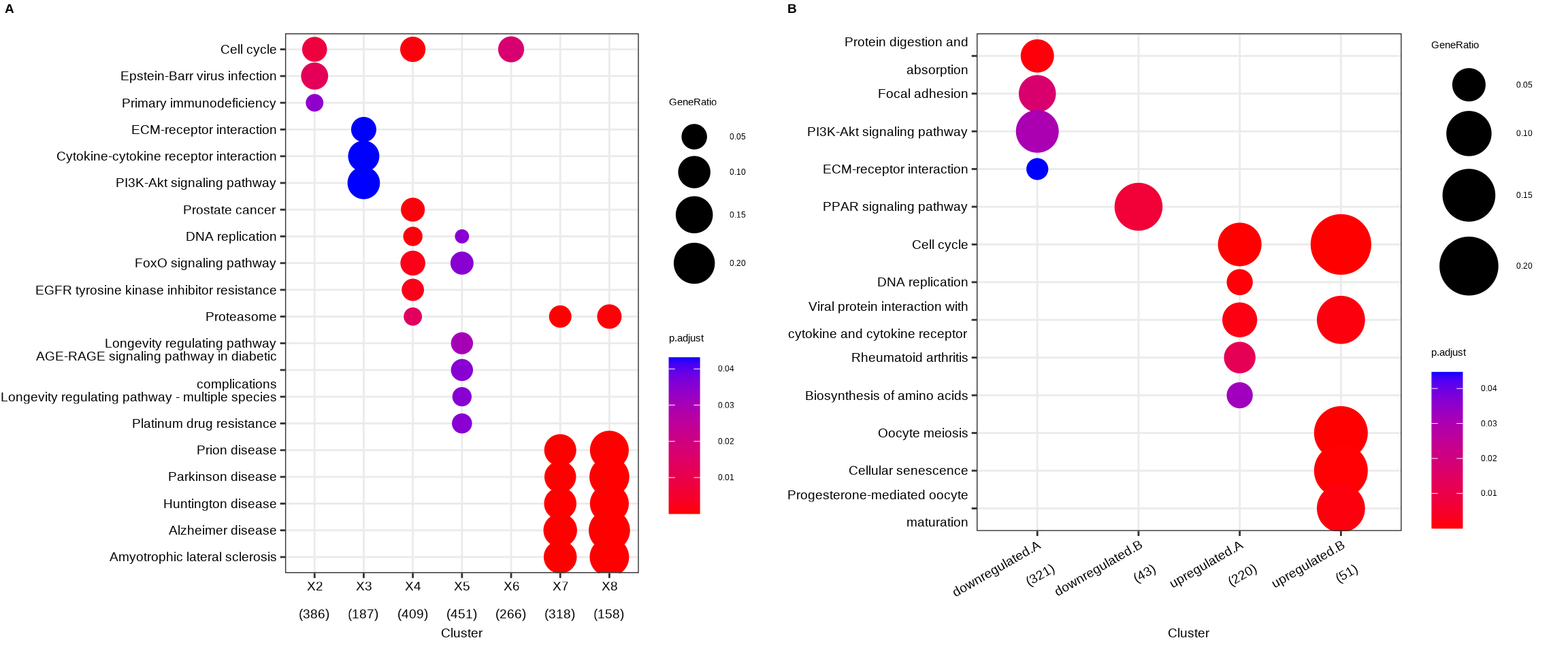
Figure 14.1: Comparing enrichment results of multiple gene lists. (A) Using a named list of gene clusters, the results were displayed as multiple columns with each one represents an enrichment result of a gene cluster. (B) Using formula interface, the columns represent gene clusters defined by the formula.
The fomula interface allows more complicated gene cluster definition. In Figure 14.1B, the gene clusters were defined by two variables (i.e. group that divides genes into upregulated and downregulated and othergroup that divides the genes into two categories of A and B.). The dotplot() function allows us to use one variable to divide the result into different facet and plot the result with other variables in each facet panel (Figure 14.2).
dotplot(formula_res, x="group") + facet_grid(~othergroup)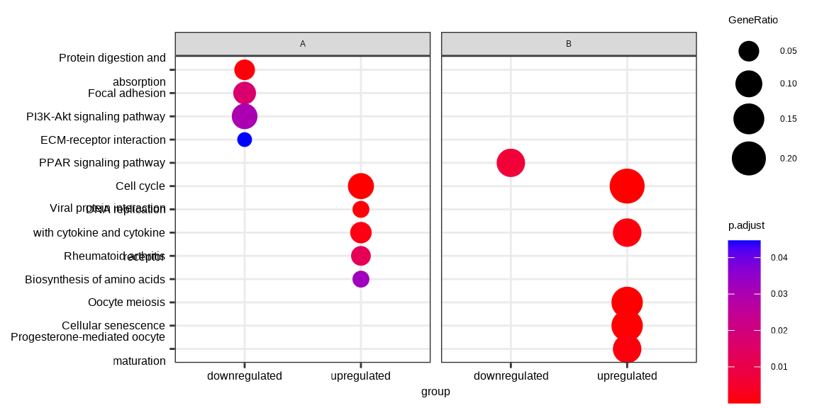
Figure 14.2: Comparing enrichment results of multiple gene lists defined by multiple variable. The results were visualized as a dot plot with an x-axis representing one level of conditions (the group variable) and a facet panel indicating another level of conditions (the othergroup variable).
By default, only top 5 (most significant) categories of each cluster
was plotted. User can changes the parameter showCategory to
specify how many categories of each cluster to be plotted, and if
showCategory was set to NULL, the whole result will
be plotted. The showCategory parameter also allows passing a vector of selected categories to plot pathway of interests
The dotplot() function tries to make the comparison among different clusters more informative and reasonable. After extracting e.g. 10 categories for each clusters, clusterProfiler tries to collect overlap of these categories among clusters. For example, term A is enriched in all the gene clusters (e.g., g1 and g2) and is in the 10 most significant categories of g1 but not g2. clusterProfiler will capture this information and include term A in g2 cluster to make the comparison in dotplot more reasonable. If users want to ignore these information, they can set includeAll = FALSE in dotplot(), which is not recommended.
The dotplot() function accepts a parameter size for setting the scale of dot sizes. The default parameter size is setting to geneRatio, which corresponding to the GeneRatio column of the output. If it was setting to count, the comparison will be based on gene counts, while if setting to rowPercentage, the dot sizes will be normalized by count/(sum of each row). Users can also map the dot size to other variables or derived variables (see Chapter 16).
To provide the full information, we also provide number of identified genes in each category (numbers in parentheses) when by is setting to rowPercentage and number of gene clusters in each cluster label (numbers in parentheses) when by is setting to geneRatio, as shown in Figure 14.1.
The p-values indicate that which categories are more likely to have biological meanings. The dots in the plot are color-coded based on their corresponding adjusted p-values. Color gradient ranging from red to blue correspond to the order of increasing adjusted p-values. That is, red indicate low p-values (high enrichment), and blue indicate high p-values (low enrichment). Adjusted p-values were filtered out by the threshold giving by the parameter pvalueCutoff, and FDR can be estimated by qvalue.
14.3.2 Gene-Concept Network
The cnetplot also works with compareCluster() result.
cnetplot(ck)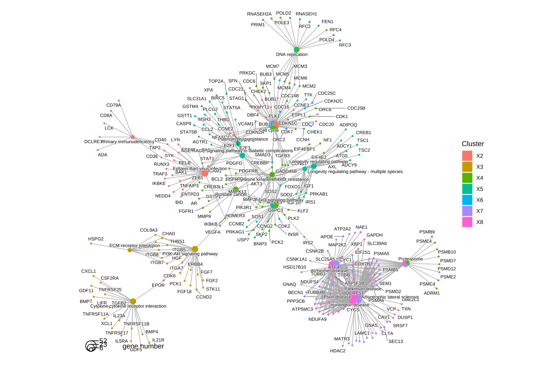
Figure 14.3: cnetplot() for comparing functional profiles of multiple gene clusters. Genes and functional categories (i.e., pathways) are encoded as pies to distinguish different gene clusters.
14.4 Summary
The comparison function was designed as a framework for comparing gene clusters of any kind of ontology associations, not only groupGO, enrichGO, enrichKEGG, enrichMKEGG, enrichWP and enricher that were provided in this package, but also other biological and biomedical ontologies, including but not limited to enrichPathway, enrichDO, enrichNCG, enrichDGN and enrichMeSH.
In (Yu et al. 2012), we analyzed the publicly available expression dataset of breast tumour tissues from 200 patients (GSE11121, Gene Expression Omnibus) (Schmidt et al. 2008). We identified 8 gene clusters from differentially expressed genes, and using the compareCluster() function to compare these gene clusters by their enriched biological process. In (Wu et al. 2021), we analyzed the GSE8057 dataset which contains expression data from ovarian cancer cells at multiple time points and under two treatment conditions. Eight groups of DEG lists were analyzed simultaneously using compareCluster() with WikiPathways. The result indicates that the two drgus have distinct effects at the begining but consistent effects in the later stages (Fig. 4 of (Wu et al. 2021)).