16 Enhanced Visualization
Once a dataset has been processed, plotting becomes the main way we inspect whether the workflow is behaving as expected. We need to check clusters, marker expression, sample composition, and structured summaries across groups, often with many small figure adjustments along the way.
sclet provides an enhanced visualization ecosystem tightly integrated with the ggsc package. It offers high-level plotting functions that operate directly on SingleCellExperiment objects while still returning standard ggplot2 objects, so you keep both convenience and full downstream customizability.
16.2 Dimensionality Reduction Plots
sclet wraps ggsc::sc_dim and ggsc::sc_feature to provide CellDimPlot and FeatureDimPlot. These functions automatically resolve the active reduction and layer from the object’s state.
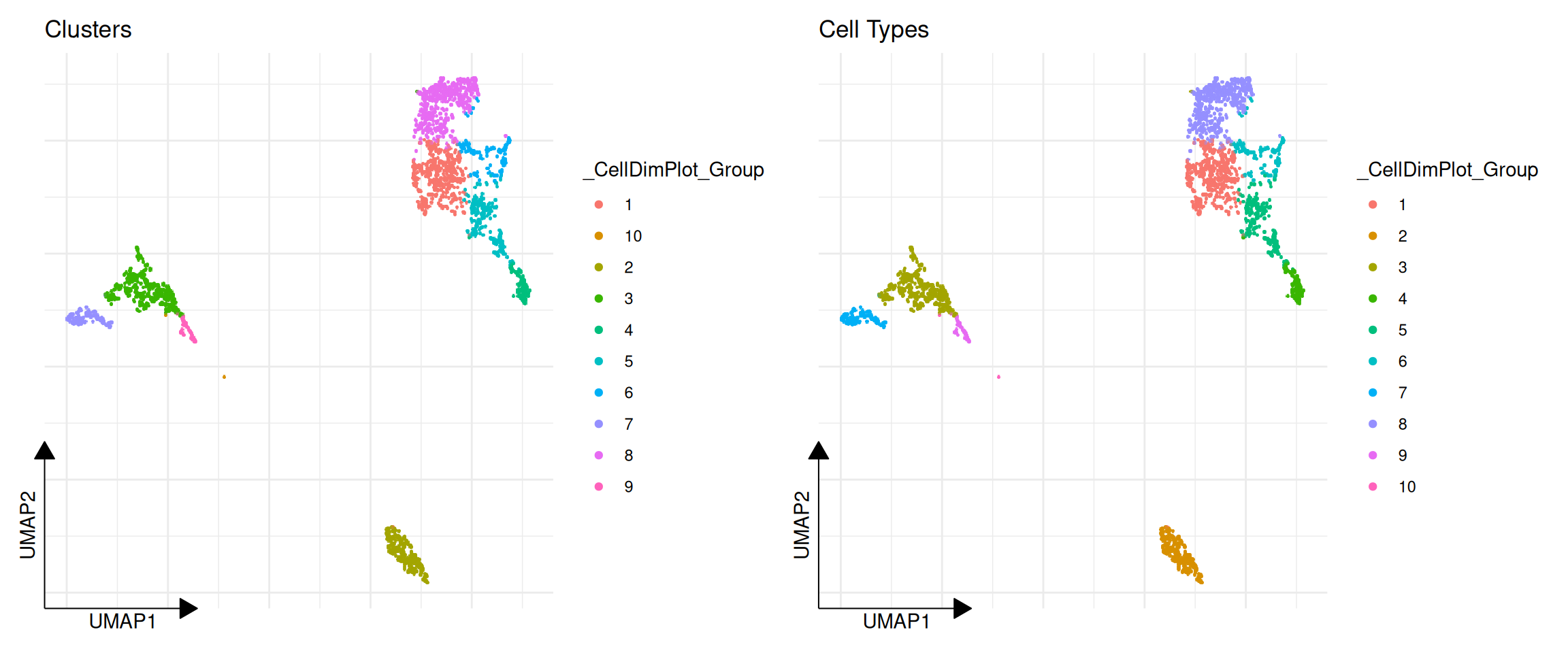
16.2.1 CellDimPlot
CellDimPlot is used to visualize categorical cell metadata on a reduced dimensional space (e.g., UMAP, PCA).
library(ggplot2)
library(aplot)

# Visualize clustering results
p1 <- CellDimPlot(pbmc, group.by = "ident") + ggtitle("Clusters")

# Visualize batch or other metadata
# Assuming we have a 'label' column in colData
if ("label" %in% colnames(colData(pbmc))) {
    p2 <- CellDimPlot(pbmc, group.by = "label") + ggtitle("Cell Types")
    plot_list(p1, p2)
} else {
    p1
}
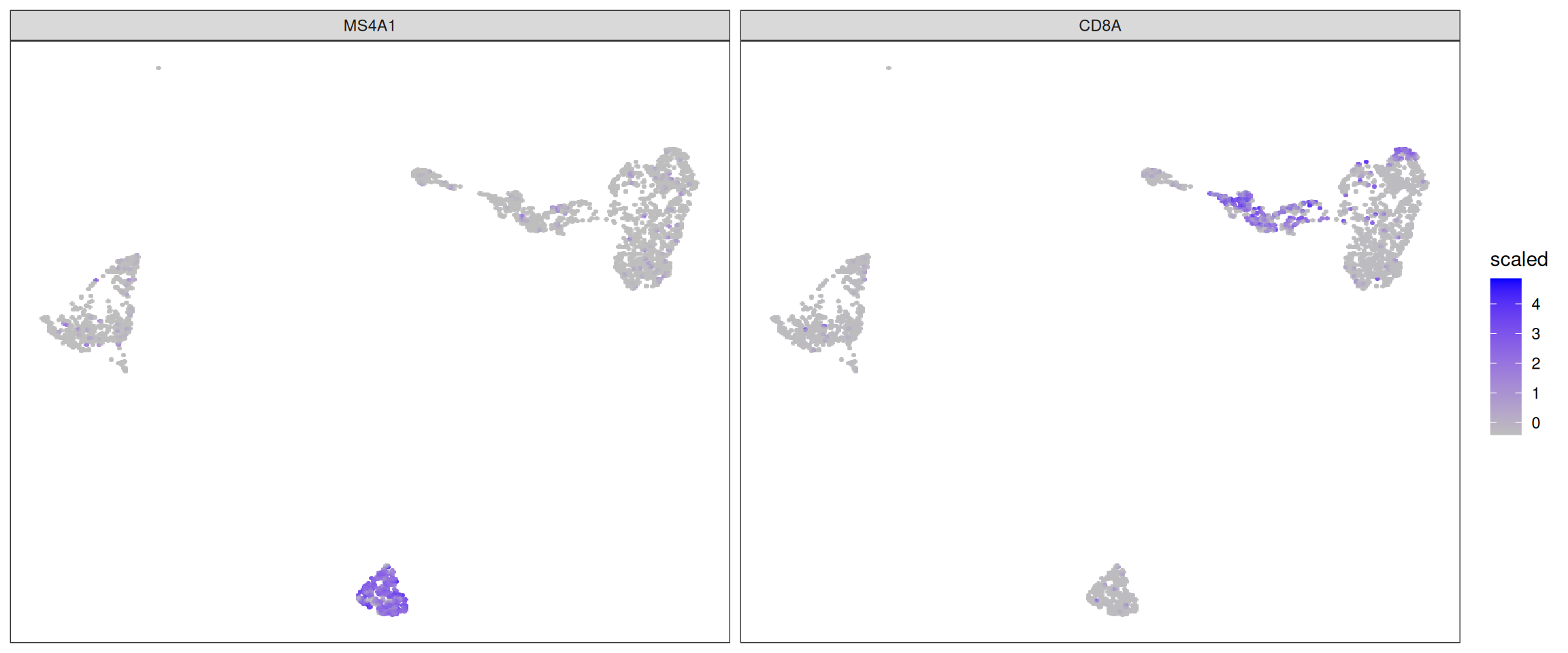
16.3 Expression Heatmaps
GroupHeatmap provides a convenient way to visualize the average expression of features across different cell groups using scater::plotGroupedHeatmap.
# Define a set of marker genes
markers <- c("IL7R", "CD14", "LYZ", "MS4A1", "CD8A", "FCGR3A", "MS4A7")

# Plot average expression by cluster
GroupHeatmap(pbmc, features = markers, group.by = "ident", scale = TRUE)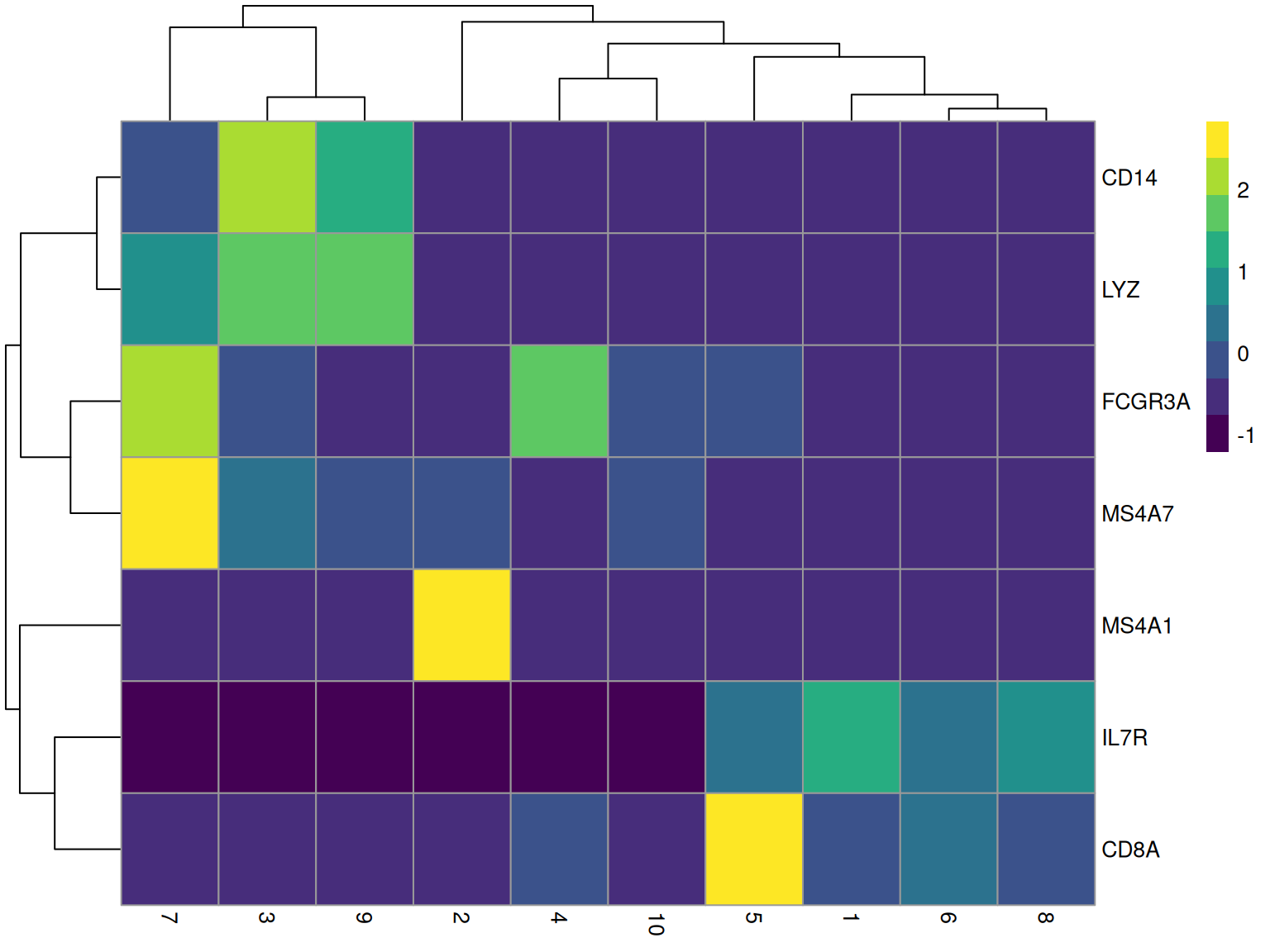
16.4 Cell Statistics
CellStatPlot is useful for visualizing the composition of cell groups (e.g., cell type proportions across different conditions).
# If we have multiple samples or batches, we can plot the proportion of each cluster
# Here we just use a simulated 'batch' column for demonstration if one doesn't exist
if (!"batch" %in% colnames(colData(pbmc))) {
    set.seed(123)
    pbmc$batch <- sample(c("Sample1", "Sample2"), ncol(pbmc), replace = TRUE)
}

CellStatPlot(pbmc, stat.by = "ident", group.by = "batch", position = "fill") +
    ylab("Proportion") +
    theme(axis.text.x = element_text(angle = 45, hjust = 1))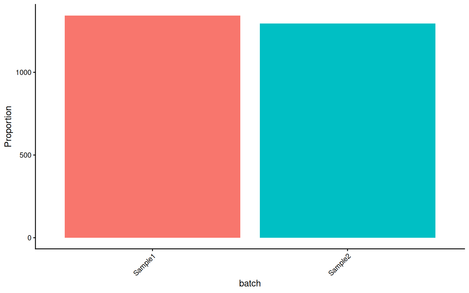
These visualization functions are designed to minimize boilerplate code while remaining fully compatible with ggplot2 grammar (+ theme(), + scale_color_manual(), etc.).
16.5 Module-Specific Visualization
Beyond the general-purpose plotting functions, sclet provides specialized visualization functions for each analysis module. These consume the typed state records directly, so you never need to manually extract matrices or metadata columns.
Note: The examples below show the intended API surface. They use eval=FALSE because the PBMC demo object used in this chapter has not been processed through trajectory, velocity, spatial, or CCI analysis pipelines. The functions themselves are fully implemented and ready to use once the corresponding module has been run.