1 Reconcile axis limits
Suppose we have the following plots and would like to combine them in a single page.
library(dplyr)
library(ggplot2)
library(ggtree)
library(patchwork)
library(aplot)

no_legend=theme(legend.position='none')

d <- group_by(mtcars, cyl) %>% summarize(mean=mean(disp), sd=sd(disp))
d2 <- dplyr::filter(mtcars, cyl != 8) %>% rename(var = cyl)

p1 <- ggplot(d, aes(x=cyl, y=mean)) +
    geom_col(aes(fill=factor(cyl)), width=1) +
    no_legend
p2 <- ggplot(d2, aes(var, disp)) +
    geom_jitter(aes(color=factor(var)), width=.5) +
    no_legend

p3 <- ggplot(filter(d, cyl != 4), aes(cyl, mean)) +
    geom_col(aes(fill=factor(cyl)), width=.6) +
    no_legend

pp <- list(p1, p2, p3)
We can use cowplot or patchwork to combine plots.
However, these plots do not align properly (Figure 1.1A).
There are two reasons:
- the plotted data have different limits
- the different plots have different amounts of expansion spaces
To address these two issues, ggtree provides xlim2() and ylim2() functions to set x or y limits1. In practice, these helpers do one thing very well: they let one plot borrow the axis range of another plot, so that a set of associated subplots can be aligned against the same scale instead of each plot inventing its own little world. When limits is supplied, the helpers behave like xlim() and ylim() (Figure 1.1B). When limits = NULL (the default), the functions calculate limits from the input ggplot object itself. That makes it easy to take one plot as the reference and apply its limits to the others, which is often the simplest way to reconcile plots with different scales (Figure 1.1C).
pp2 <- lapply(pp, function(p) p + xlim2(limits=c(3, 11)))
pp3 <- lapply(pp, function(p) p + xlim2(p1))

plot_list(gglist = pp2, ncol=1)
plot_list(gglist = pp3, ncol=1)
If the plot was flipped, it will throw a message and apply the another axis. In this example, the x limit of p1 is applied to y limit of p3 as p3 was flipped.
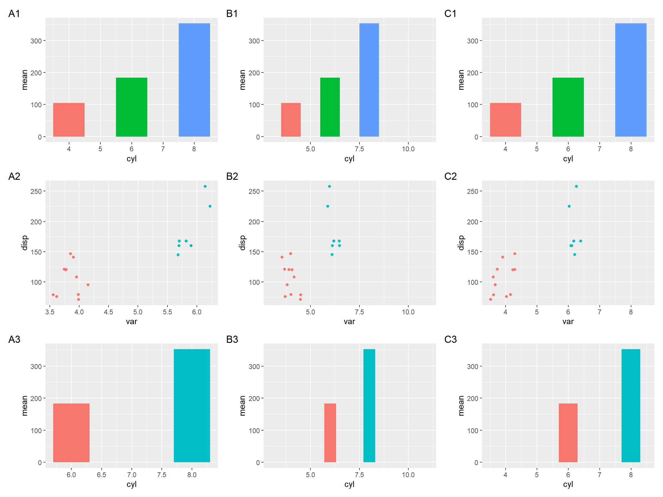
Figure 1.1: Setting x-axis limits for aligning plots. Composite plot that does not align properly (A column), align based on user specific limits (B column), and align based on xlim of the p1 object (C column).
Similarly, we can use ylim2() to reconcile y axis. As we can see in Figure 1.2, only panel A and C were aligned properly.
p <- ggplot(mtcars, aes(disp, cyl, group=cyl)) + geom_boxplot()
p1 <- ggplot(subset(mtcars, cyl!=8), aes(disp, cyl, group=cyl)) + geom_point()
p2 <- p1 + ylim2(p)
p + p1 + p2 +
  plot_annotation(tag_levels="A")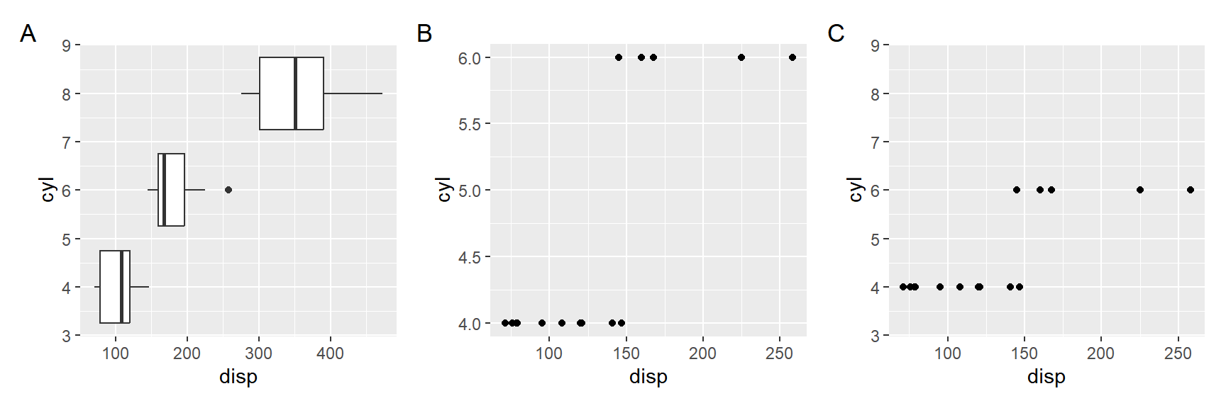
Figure 1.2: Setting y-axis limits for aligning plots. Composite plot that does not align properly (A vs B), and align based on ylim of the p object (A vs C).
the implementation was inspired by https://thackl.github.io/ggtree-composite-plots↩︎