4 Align Associated plots
For many times, we are not just aligning plots as what cowplot and patchwork did. We would like to align associated information that requires axes to be exactly matched in subplots.
4.1 Reconcile axis limits
Suppose we have the following plots and would like to combine them in a single page.
library(dplyr)
library(ggplot2)
library(ggstance)
library(ggtree)
library(patchwork)
library(aplot)

no_legend=theme(legend.position='none')

d <- group_by(mtcars, cyl) %>% summarize(mean=mean(disp), sd=sd(disp))
d2 <- dplyr::filter(mtcars, cyl != 8) %>% rename(var = cyl)

p1 <- ggplot(d, aes(x=cyl, y=mean)) +
    geom_col(aes(fill=factor(cyl)), width=1) +
    no_legend
p2 <- ggplot(d2, aes(var, disp)) +
    geom_jitter(aes(color=factor(var)), width=.5) +
    no_legend

p3 <- ggplot(filter(d, cyl != 4), aes(mean, cyl)) +
    geom_colh(aes(fill=factor(cyl)), width=.6) +
    coord_flip() + no_legend

pp <- list(p1, p2, p3)
We can use cowplot or patchwork to combine plots.
plot_list(pp, ncol=1)However, these plots do not align properly (Figure 4.1A).
There are two reasons:
- the plotted data have different limits
- the different plots have different amounts of expansion spaces
To address these two issues, ggtree provides xlim2() and ylim2() functions to set x or y limits1. It use input limits to set axis limits that is similar to xlim() and ylim() (Figure 4.1B). If limits = NULL (by default), the xlim2() and ylim2() functions will calculate axis limits from input ggplot object. So that we can easily set limits of a ggplot object based on another ggplot object to uniformize their limits (Figure 4.1C).
pp2 <- lapply(pp, function(p) p + xlim2(limits=c(3, 11)))
pp3 <- lapply(pp, function(p) p + xlim2(p1))

plot_list(pp2, ncol=1)
plot_list(pp3, ncol=1)
If the plot was flipped, it will throw a message and apply the another axis. In this example, the x limit of p1 is applied to y limit of p3 as p3 was flipped.
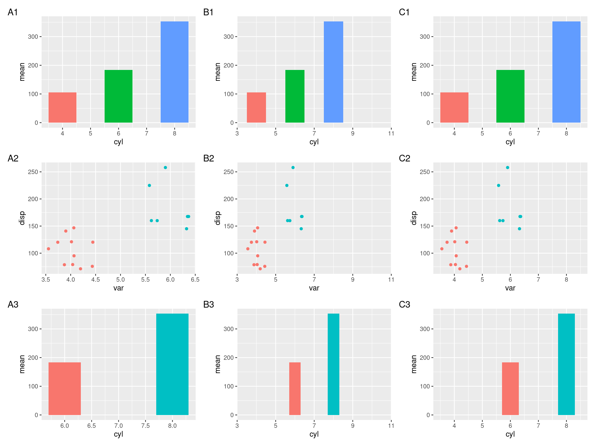
Figure 4.1: Setting x-axis limits for aligning plots. Composite plot that does not align properly (A column), align based on user specific limits (B column), and align based on xlim of the p1 object (C column).
Similarly, we can use ylim2() to reconcile y axis. As we can see in Figure 4.2, only panel A and C were aligned properly.
library(ggstance)
p <- ggplot(mtcars, aes(disp, cyl, group=cyl)) + geom_boxploth()
p1 <- ggplot(subset(mtcars, cyl!=8), aes(disp, cyl, group=cyl)) + geom_point()
p2 <- p1 + ylim2(p)
p + p1 + p2 +
  plot_annotation(tag_levels="A")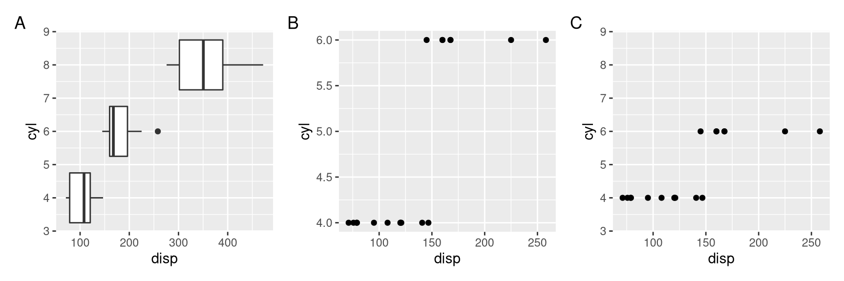
Figure 4.2: Setting y-axis limits for aligning plots. Composite plot that does not align properly (A vs B), and align based on ylim of the p object (A vs C).
4.2 Align associated subplots
With xlim2() and ylim2(), it is easy to align associated subplots to annotate a main figure. The aplot package provides insert_left(), insert_right(), insert_top() and insert_bottom() as shortcut to help users aligning subplots.
4.2.1 A first glance
library(ggplot2)
library(aplot)

p <- ggplot(mtcars, aes(mpg, disp)) + geom_point()
p2 <- ggplot(mtcars, aes(mpg)) +
  geom_density(fill='steelblue', alpha=.5) +
  ggtree::theme_dendrogram()
p3 <- ggplot(mtcars, aes(x=1, y=disp)) +
  geom_boxplot(fill='firebrick', alpha=.5) +
  theme_void()
ap <- p %>%
  insert_top(p2, height=.3) %>%
  insert_right(p3, width=.1)
## you can use `ggsave(filename="aplot.png", plot=ap)` to export the plot to image file
print(ap) # or just type ap will print the figure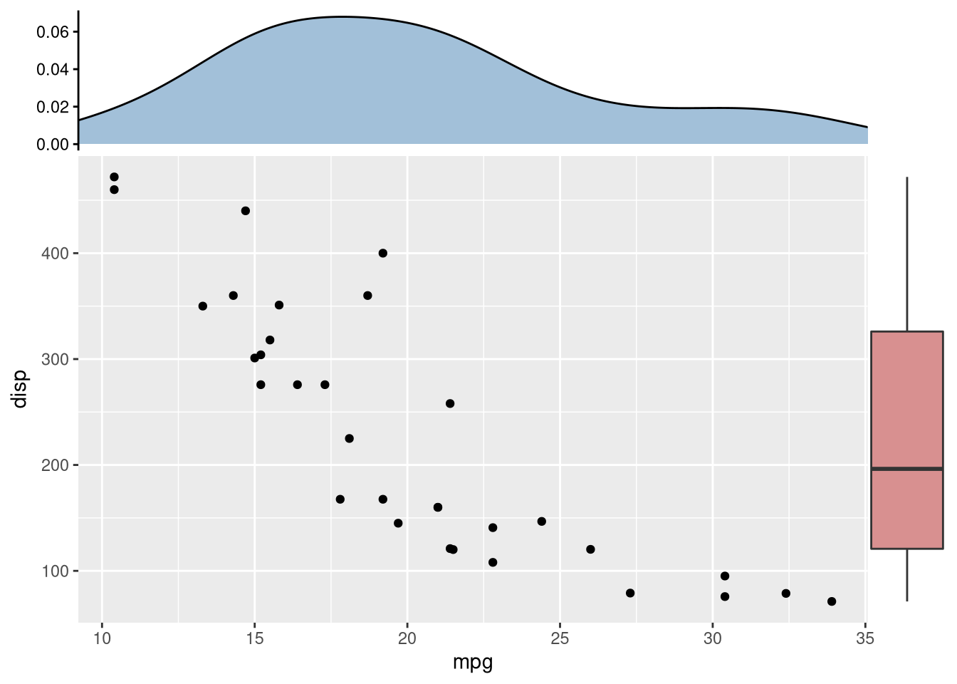
4.2.2 Aligning plots with a tree
Aligning a plot with a tree is difficult, as it requres expertise to extract the order of taxa on the tree.
library(ggtree)
set.seed(2020-03-27)
x <- rtree(10)
d <- data.frame(taxa=x$tip.label, value = abs(rnorm(10)))
p <- ggtree(x) + geom_tiplab(align = TRUE) + xlim(NA, 3)

library(ggstance)
p2 <- ggplot(d, aes(value, taxa)) + geom_colh() +
  scale_x_continuous(expand=c(0,0))

library(patchwork)
p | p2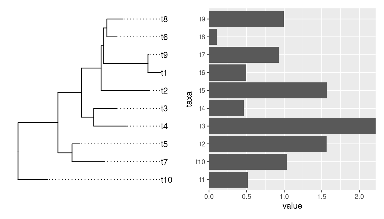
Althought patchwork did a good job at aligning y-axes among the two plots, the output is not what we want if the bar heights are associated with external nodes on the tree. It is not so obvious for an ordinary user to extract the order of tip label from the tree to re-draw the barplot.
If we insert a ggtree object in aplot, it will transform other plots in the same row (insert_left and insert_right) or same column (insert_top and insert_bottom) based on the tree structure.
p2 %>% insert_left(p)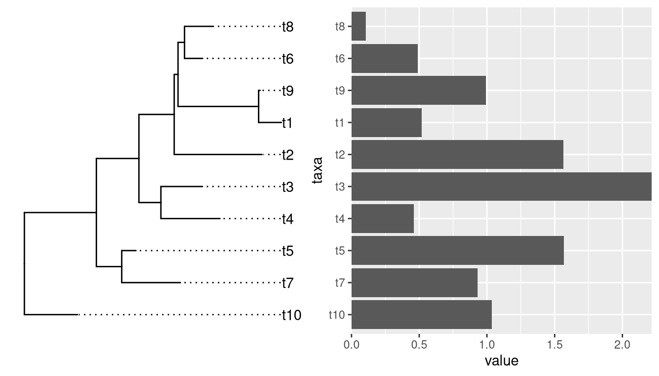
Example from https://github.com/YuLab-SMU/ggtree/issues/339.
require(ggtree)
require(ggplot2)
require(dplyr)
require(gggenes)

tree <- read.tree("data/nbh.nwk")
nbh <- read.csv("data/nbh.csv")

tree_plot <- ggtree(tree) +
  geom_tiplab(aes(label=label))


nbh_plot <- ggplot(
  (nbh %>% select(label, block_id,pid,start,end,strand) %>% distinct()),
  aes(xmin = start, xmax = end, y = block_id, forward = strand) # as_factor(block_id)
) +
  geom_gene_arrow() +
  #scale_fill_brewer(palette = "Set3") +
  theme_genes() %+replace%
  theme(panel.grid.major.y = element_line(colour = NULL)) + # , linetype = "dotted")) +
  #theme_classic() +
  theme(
    axis.title.x=element_blank(),
    #axis.text.x=element_blank(),
    axis.ticks.x=element_blank(),
    #axis.line.x = element_blank(),
    axis.title.y=element_blank(),
    #axis.text.y=element_blank(),
    axis.ticks.y=element_blank(),
    axis.line.y = element_blank()
  )


require(aplot)

insert_left(nbh_plot, tree_plot)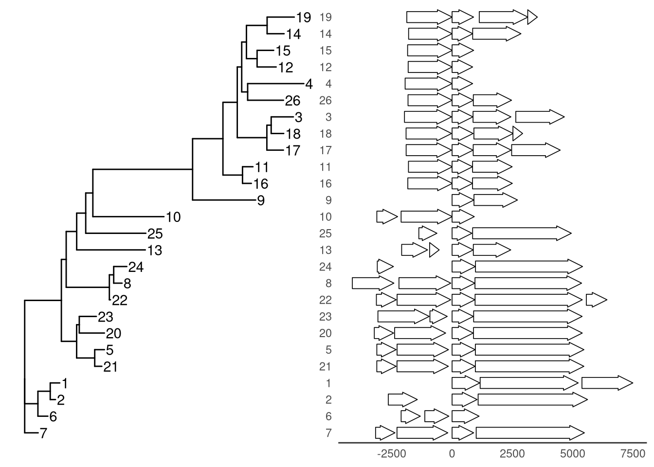
Example from https://github.com/YuLab-SMU/ggtree/issues/313.
set.seed(20200618)

## Create a random tree
tre <- rtree(10)
tre$tip.label <- letters[1:10]

## Build matrix with some random numbers in long format so can be plotted as "heatmap" using geom_tile
gmat <- expand.grid(x = letters[1:10], y = letters[1:10])
gmat$v <- rexp(100, rate=.1)

## Generate some reandom numbres for a line plot
gline <- tibble(x = letters[1:10], y = rnorm(10, 10, 2))

## Generate some random percentages for a bar plot
gbar <- tibble(x = letters[1:10], y = round(runif(10) * 100,1))

## Construct ggtree
ptre <- ggtree(tre) + geom_tiplab() +
    geom_nodepoint(colour = 'firebrick', size=3)


## Constuct companion plots
pmat <- ggplot(gmat, aes(x,y, fill=v)) + geom_tile()
pbar <- ggplot(gbar, aes(x,y)) + geom_col() + coord_flip() + ylab(NULL)
pline <- ggplot(gline, aes(x,y)) +
    geom_line(aes(group = 1)) + geom_point() + coord_flip()

cowplot::plot_grid(ptre, pmat, pbar, pline, ncol=4)

library(aplot)

pmat %>% insert_left(ptre) %>% insert_right(pbar) %>% insert_right(pline)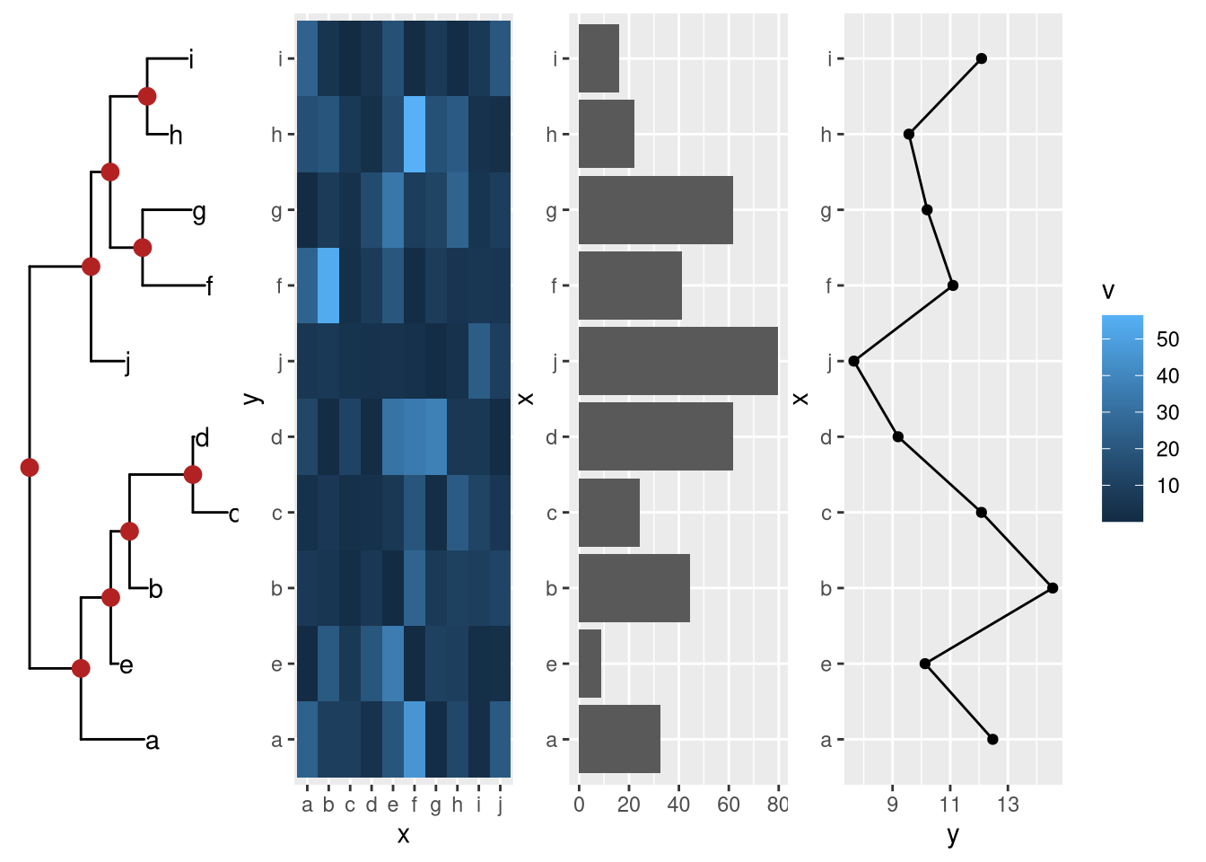
4.2.3 Creating annotated heatmap
The xlim2() and ylim2() functions create many possibilities to align figures. For instance, we can add column and row annotations around a heatmap in all sides (top, bottom, left and right). They can be aligned properly with the aids of xlim2() and ylim2() even with missing values presented as demonstrated in Figure 4.3.
library(tidyr)
library(ggplot2)
library(ggtree)

set.seed(2019-11-07)
d <- matrix(rnorm(25), ncol=5)
rownames(d) <- paste0('g', 1:5)
colnames(d) <- paste0('t', 1:5)
hc <- hclust(dist(d))
hcc <- hclust(dist(t(d)))
phr <- ggtree(hc)
phc <- ggtree(hcc) + layout_dendrogram()

d <- data.frame(d)
d$gene <- rownames(d)
dd <- gather(d, 1:5, key="condition", value='expr')

p <- ggplot(dd, aes(condition,gene, fill=expr)) + geom_tile() +
  scale_fill_viridis_c() +
  scale_y_discrete(position="right") +
  theme_minimal() +
  xlab(NULL) + ylab(NULL)

g <- ggplot(dplyr::filter(dd, gene != 'g2'), aes(gene, expr, fill=gene)) +
  geom_boxplot() + coord_flip() +
  scale_fill_brewer(palette = 'Set1') +
  theme_minimal() +
  theme(axis.text.y = element_blank(),
        axis.ticks.y = element_blank(),
        panel.grid.minor = element_blank(),
        panel.grid.major.y = element_blank()) +
  xlab(NULL) + ylab(NULL)

ca <- data.frame(condition = paste0('t', 1:5),
                 A1 = rep(LETTERS[1:2], times=c(3, 2)),
                 A2 = rep(letters[3:5], times=c(1, 3, 1))
)
cad <- gather(ca, A1, A2, key='anno', value='type')

pc <- ggplot(cad, aes(condition, y=anno, fill=type)) + geom_tile() +
  scale_y_discrete(position="right") +
  theme_minimal() +
  theme(axis.text.x = element_blank(),
        axis.ticks.x = element_blank()) +
  xlab(NULL) + ylab(NULL)

set.seed(123)
dp <- data.frame(gene=factor(rep(paste0('g', 1:5), 2)),
                 pathway = sample(paste0('pathway', 1:5), 10, replace = TRUE))

pp <- ggplot(dp, aes(pathway, gene)) +
  geom_point(size=5, color='steelblue') +
  theme_minimal() +
  theme(axis.text.x=element_text(angle=90, hjust=0),
        axis.text.y = element_blank(),
        axis.ticks.y = element_blank()) +
  xlab(NULL) + ylab(NULL)


p %>% insert_left(phr, width=.3) %>%
  insert_right(pp, width=.4)  %>%
  insert_right(g, width=.4) %>%
  insert_top(pc, height=.1) %>%
  insert_top(phc, height=.2)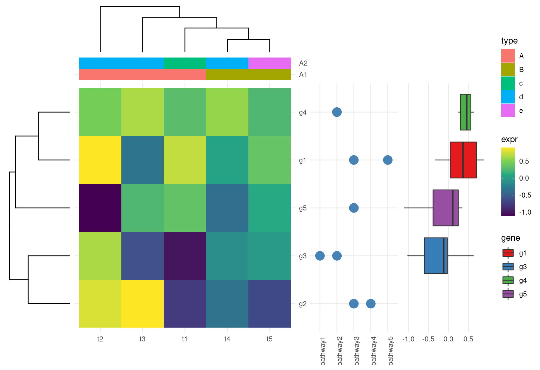
Figure 4.3: Create complex heatmap. With the helps of xlim2() and ylim2(), it is easy to align row or column annotations around a figure (e.g. a heatmap).
4.2.4 A single cell example
Example taken from https://davemcg.github.io/post/lets-plot-scrna-dotplots/
library(readr)
library(tidyr)
library(dplyr)
library(ggplot2)
library(ggtree)

file <- system.file("extdata", "scRNA_dotplot_data.tsv.gz", package="aplot")
gene_cluster <- readr::read_tsv(file)

dot_plot <- gene_cluster %>%
  mutate(`% Expressing` = (cell_exp_ct/cell_ct) * 100) %>%
  filter(count > 0, `% Expressing` > 1) %>%
  ggplot(aes(x=cluster, y = Gene, color = count, size = `% Expressing`)) +
  geom_point() +
  cowplot::theme_cowplot() +
  theme(axis.line  = element_blank()) +
  theme(axis.text.x = element_text(angle = 90, vjust = 0.5, hjust=1)) +
  ylab(NULL) +
  theme(axis.ticks = element_blank()) +
  scale_color_gradientn(colours = viridis::viridis(20), limits = c(0,4), oob = scales::squish, name = 'log2 (count + 1)') +
  scale_y_discrete(position = "right")


mat <- gene_cluster %>%
  select(-cell_ct, -cell_exp_ct, -Group) %>%  # drop unused columns to faciliate widening
  pivot_wider(names_from = cluster, values_from = count) %>%
  data.frame() # make df as tibbles -> matrix annoying
row.names(mat) <- mat$Gene  # put gene in `row`
mat <- mat[,-1] #drop gene column as now in rows
clust <- hclust(dist(mat %>% as.matrix())) # hclust with distance matrix

ggtree_plot <- ggtree::ggtree(clust)

v_clust <- hclust(dist(mat %>% as.matrix() %>% t()))
ggtree_plot_col <- ggtree(v_clust) + layout_dendrogram()


labels= ggplot(gene_cluster, aes(cluster, y=1, fill=Group)) + geom_tile() +
  scale_fill_brewer(palette = 'Set1',name="Cell Type") +
  theme_void()

library(patchwork)
ggtree_plot | dot_plot | (ggtree_plot_col / labels)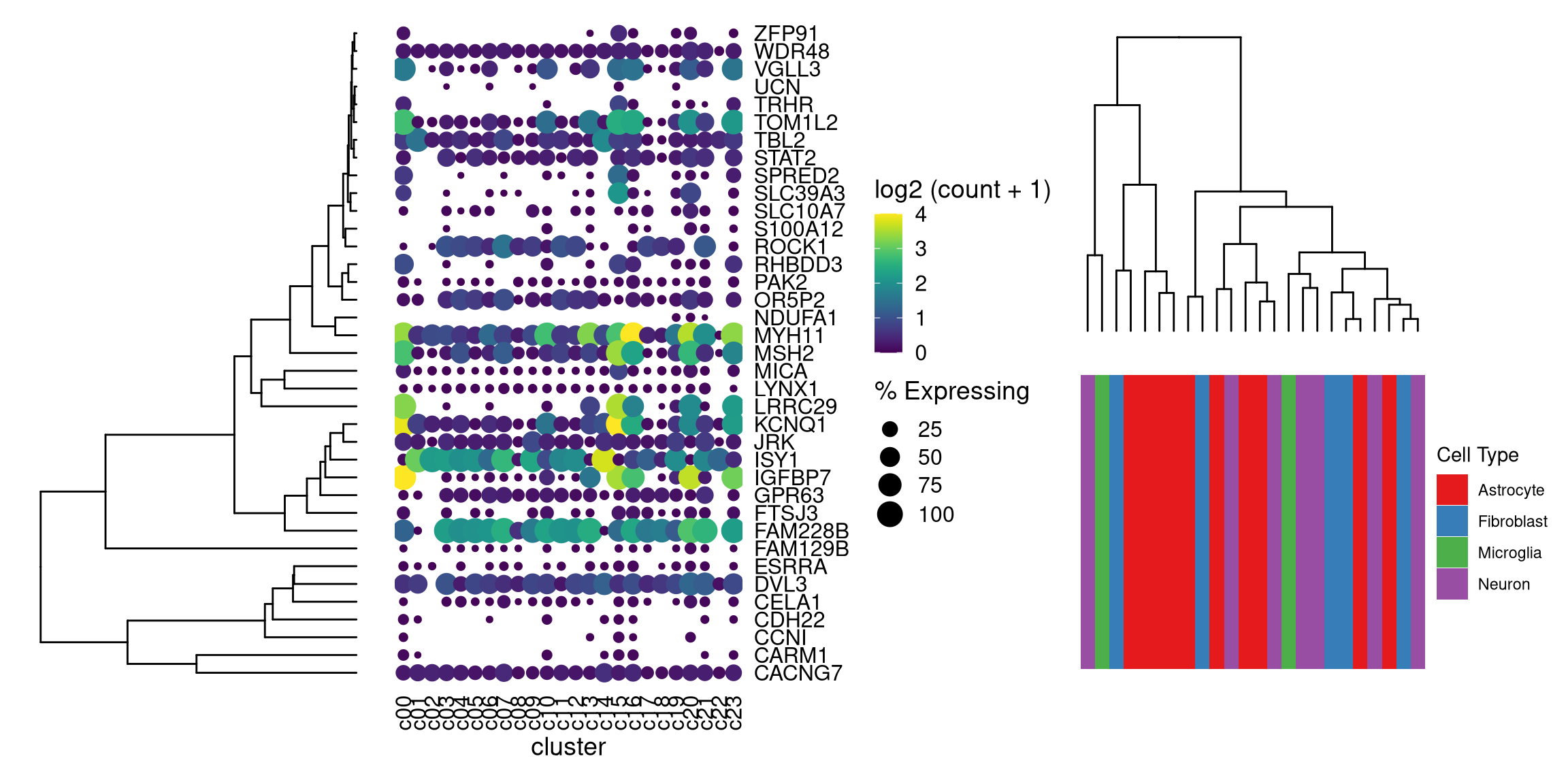
library(aplot)
## the rows of the dot_plot was automatically reorder based on the tree
dot_plot %>%
insert_left(ggtree_plot, width=.2) 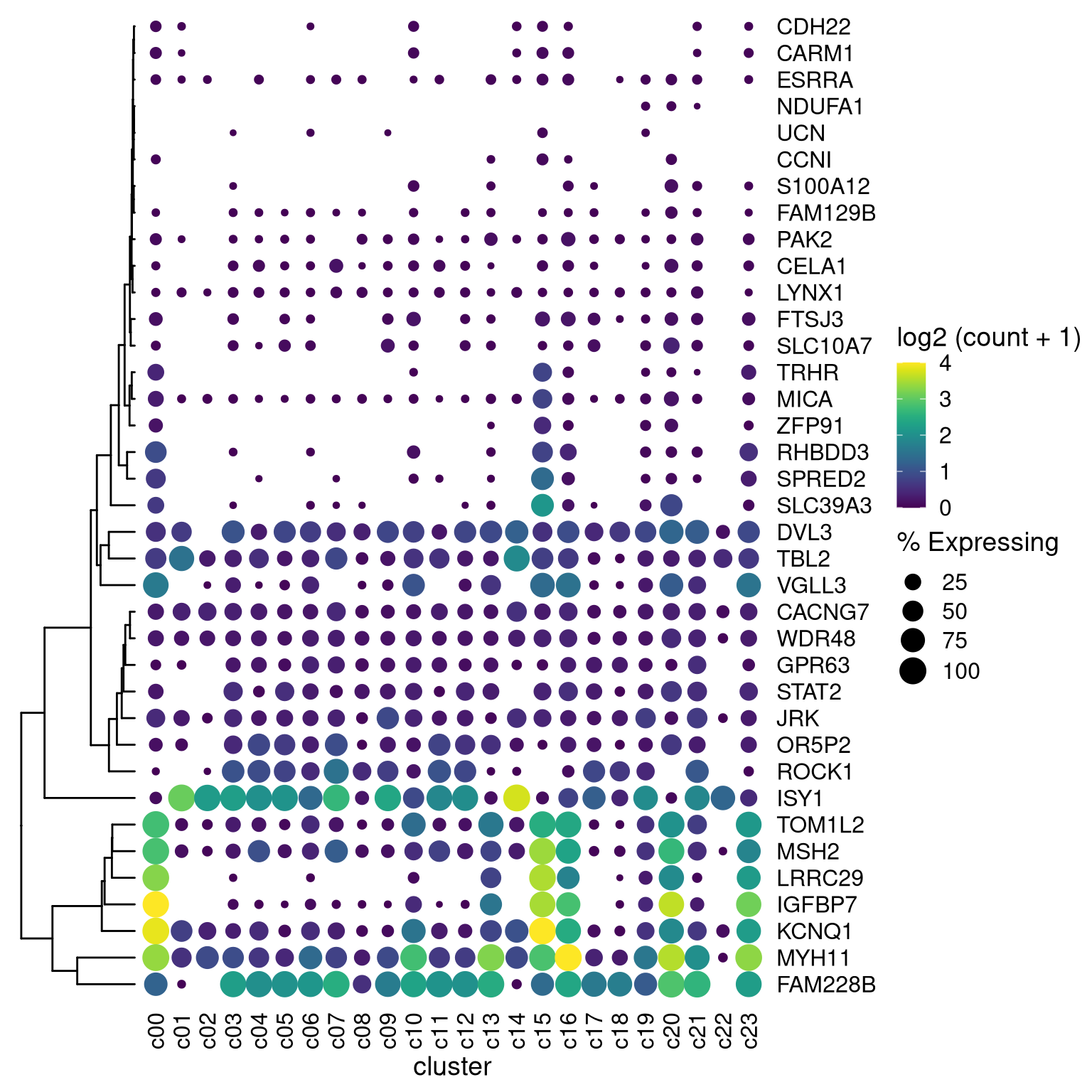
## the columns of the dot_plot was automatically reorder based on the tree
dot_plot %>%
  insert_left(ggtree_plot, width=.2) %>%
  insert_top(labels, height=.02) %>%
  insert_top(ggtree_plot_col, height=.1)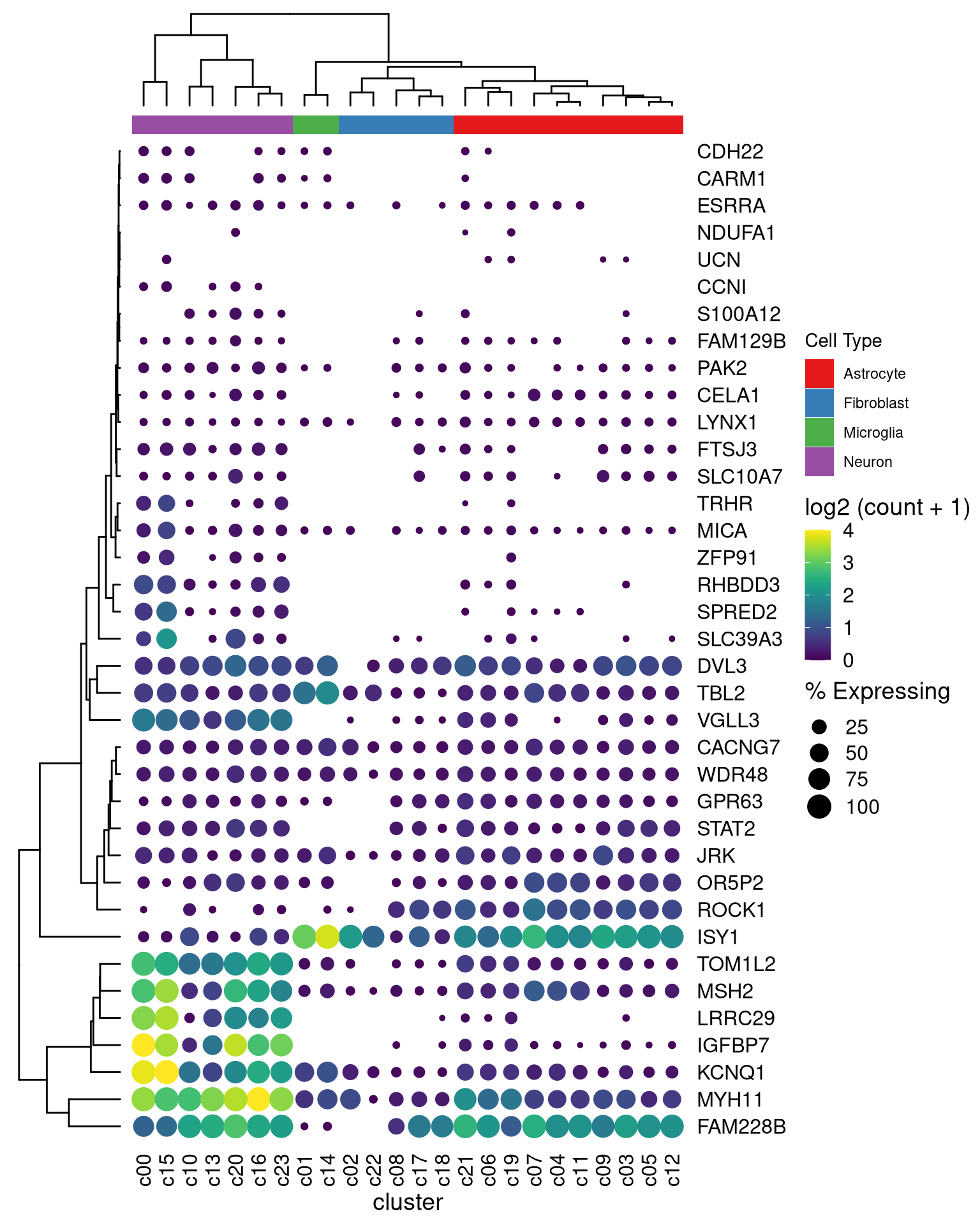
the implementation was inspired by https://thackl.github.io/ggtree-composite-plots↩︎