
ggplot2出第二版我被hadley wickham致谢了,并且他给我寄来了签名书。很多人想问我怎么学画图,我只有一个秘籍,那就是勤加练习。我时常问自己,这个图我能不能画出来?若干年前,翻阅了一个简单的入门书,我就把里面所有的图片自己画了一遍,也就是本文了,虽然都比较简单,做为入门练习正正好,简单的图画多了,才有可能画复杂的图。复杂的图画多了,才有可能有所突破。
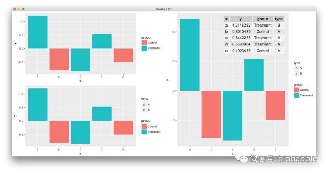
比如ggplot2中aes映射是不会作用于axis text的,theme也不能用aes映射,我就写了个函数,可以用选定变量给axis text上色并自动加入图例:
道理你都懂,学习无非是从简单入手,刻意练习,大量刻意的练习,走学术这条路,画图是躲不过的,不要再欺骗自己说Prism够用,ggplot2必须要搞起来,小白可以从点鼠标开始,请参考:
最后代码搞起来,而最好的学习资料莫过于作者的书,当然中文资料相对滞后。而进阶装逼,当然要持续关注本公众号。
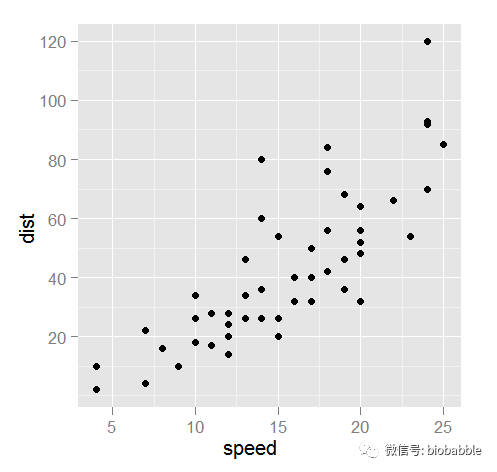
1.16 Creating a Scatter Plot
plot(cars)
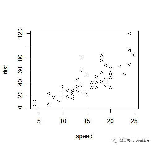
ggplot(cars,aes(speed,dist))+geom_point()
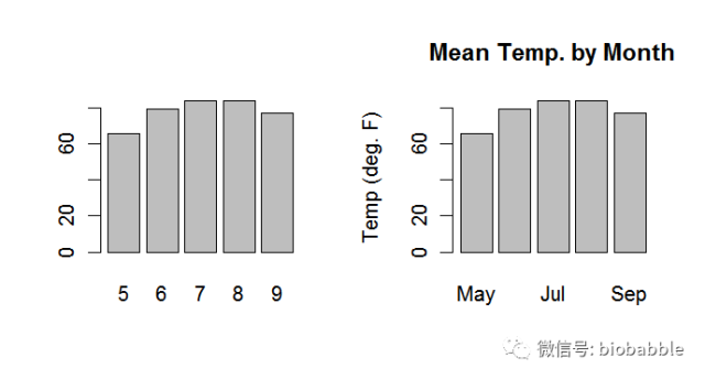
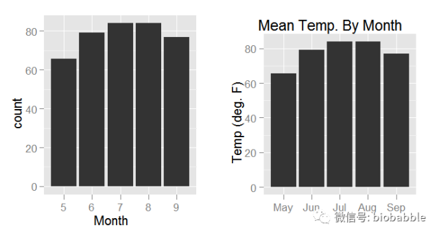
1.17 Creating a Bar Chart
heights <- tapply(airquality$Temp, airquality$Month, mean)    par(mfrow=c(1,2))
barplot(heights)
barplot(heights,
        main="Mean Temp. by Month",
        names.arg=c("May", "Jun", "Jul", "Aug", "Sep"),
        ylab="Temp (deg. F)")
require(gridExtra)
heights=ddply(airquality,.(Month), mean)
heights$Month=as.character(heights$Month)
p1 <- ggplot(heights, aes(x=Month,weight=Temp))+ geom_bar()
p2 <- ggplot(heights, aes(x=factor(Month,
                          labels=c("May", "Jun", "Jul", "Aug", "Sep")),
                          weight=Temp))+
        geom_bar()+
        ggtitle("Mean Temp. By Month") +
        xlab("") + ylab("Temp (deg. F)")
grid.arrange(p1,p2, ncol=2)
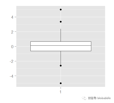
1.18 Creating a Box Plot
y <- c(-5, rnorm(100), 5)boxplot(y)

ggplot()+geom_boxplot(aes(x=factor(1),y=y))+xlab("")+ylab("")
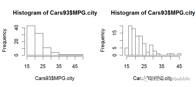
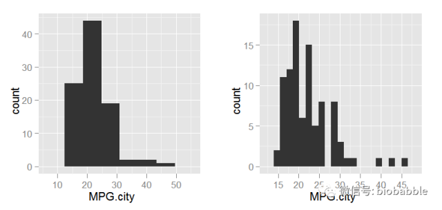
1.19 Creating a Histogram
data(Cars93, package="MASS")
par(mfrow=c(1,2))
hist(Cars93$MPG.city)
hist(Cars93$MPG.city, 20)
p <- ggplot(Cars93, aes(MPG.city))
p1 <- p + geom_histogram(binwidth=diff(range(Cars93$MPG.city))/5)
p2 <- p + geom_histogram(binwidth=diff(range(Cars93$MPG.city))/20)
grid.arrange(p1,p2, ncol=2)
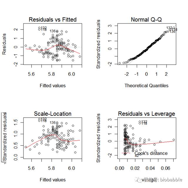
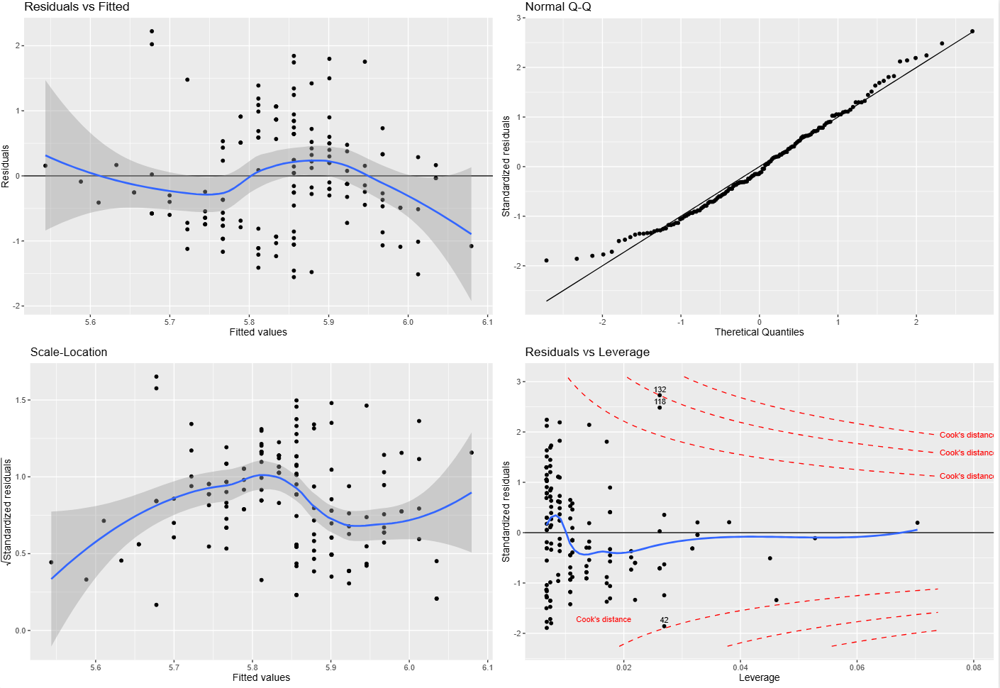
1.23 Diagnosing a Linear Regression
data(iris)
m = lm( Sepal.Length ~ Sepal.Width, data=iris)
par(mfrow=c(2,2))
plot(m)
r  <-  residuals(m)
yh  <-  predict(m)
scatterplot  <-  function(x,y,
            title="",
            xlab="",
            ylab="")  {
  d  <-  data.frame(x=x,y=y)
  p  <-  ggplot(d,  aes(x=x,y=y))  +
      geom_point()  +
      ggtitle(title)  +
      xlab(xlab)  +
      ylab(ylab)
  return(p)
}

p1  <-  scatterplot(yh,r,
         title="Residuals  vs  Fitted",
         xlab="Fitted  values",
         ylab="Residuals")
p1  <-  p1  +geom_hline(yintercept=0)+geom_smooth()

s  <-  sqrt(deviance(m)/df.residual(m))
hii  <-  lm.influence(m,  do.coef  =  FALSE)$hat
rs  <-  r/(s  *  sqrt(1  -  hii))
qqplot  <-  function(y,
           distribution=qnorm,
           title="Normal  Q-Q",
           xlab="Theretical  Quantiles",
           ylab="Sample  Quantiles")  {
  require(ggplot2)
  x  <-  distribution(ppoints(y))
  d  <-  data.frame(x=x,  y=sort(y))
  p  <-  ggplot(d,  aes(x=x,  y=y))  +
    geom_point()  +
    geom_line(aes(x=x,  y=x))  +
    ggtitle(label=title)  +
    xlab(xlab)  +
    ylab(ylab)
  return(p)
}
p2  <-  qqplot(rs,  ylab="Standardized  residuals")

sqrt.rs  <-  sqrt(abs(rs))
p3  <-  scatterplot(yh,sqrt.rs,
         title="Scale-Location",
         xlab="Fitted  values",
         ylab=expression(sqrt("Standardized  residuals")))
p3  <-  p3  +  geom_smooth()

cd  <-  cooks.distance(m)
p  <-  m$rank
y4_lim  <-  extendrange(rs,  f=0.08)
x4_max  <-  max(hii)  *  1.05
cook_levels  <-  c(0.5,  1)
cook_y  <-  sqrt(cook_levels  *  p  *  (1  -  x4_max)  /  x4_max)
if  (all(cook_y  >  y4_lim[2]))  {
  cook_levels  <-  pretty(c(0,  max(cd)),  n=3)
  cook_levels  <-  cook_levels[cook_levels  >  0]
}
h_seq  <-  seq(max(min(hii[hii  >  0]),  1e-4),  x4_max,  length.out=200)
cook_curve  <-  expand.grid(h=h_seq,  level=cook_levels)
cook_curve$rs  <-  sqrt(cook_curve$level  *  p  *  (1  -  cook_curve$h)  /  cook_curve$h)
cook_curve$side  <-  "upper"
cook_curve2  <-  cook_curve
cook_curve2$rs  <-  -cook_curve2$rs
cook_curve2$side  <-  "lower"
cook_curve  <-  rbind(cook_curve,  cook_curve2)
cook_curve  <-  subset(cook_curve,  rs  >=  y4_lim[1]  &  rs  <=  y4_lim[2])
cook_label_df  <-  data.frame(level=cook_levels)
cook_label_df$h  <-  x4_max
cook_label_df$rs  <-  sqrt(cook_label_df$level  *  p  *  (1  -  x4_max)  /  x4_max)
cook_label_df$label  <-  paste0("Cook's  distance  =  ",  cook_label_df$level)
cook_label_df  <-  subset(cook_label_df,  rs  >=  y4_lim[1]  &  rs  <=  y4_lim[2])
legend_df  <-  data.frame(
  x=min(hii)  +  diff(range(hii))  *  0.08,
  y=y4_lim[1]  +  diff(y4_lim)  *  0.10,
  label="Cook's  distance"
)
top_id  <-  order(cd,  decreasing=TRUE)[1:3]
point_label  <-  data.frame(hii=hii[top_id],  rs=rs[top_id],  label=top_id)

p4  <-  scatterplot(hii,rs,
         title="Residuals  vs  Leverage",
         xlab="Leverage",
         ylab="Standardized  residuals")
p4  <-  p4+
  geom_hline(yintercept=0)+
  geom_smooth(se=FALSE)  +
  geom_line(data=cook_curve,
       aes(x=h,  y=rs,  group=interaction(level,  side)),
       inherit.aes=FALSE,  linetype=2,  colour="red")  +
  geom_text(data=legend_df,
       aes(x=x,  y=y,  label=label),
       inherit.aes=FALSE,  hjust=0,  size=3,  colour="red")  +
  geom_text(data=cook_label_df,
       aes(x=h,  y=rs,  label=label),
       inherit.aes=FALSE,  hjust=-0.02,  size=3,  colour="red")  +
  geom_text(data=point_label,
       aes(x=hii,  y=rs,  label=label),
       inherit.aes=FALSE,  vjust=-0.6,  size=3)  +
  coord_cartesian(xlim=c(min(hii),  x4_max  *  1.08),  ylim=y4_lim)

grid.arrange(p1,p2,p3,p4,  ncol=2)
补充说明:Cook’s distance 到底是怎么算的,为什么在 plot(m) 里经常看不到?
Cook's distance 用来衡量:删掉某一个观测点之后,整个回归拟合会被改变多少。 这个量不是单纯看残差大不大,而是同时把两件事合在一起考虑:
- 这个点的残差是不是大;
- 这个点的 leverage(杠杆值,
hii)是不是高。
对于线性模型,可以直接让 R 计算:
cooks.distance(m)如果写成常见的公式形式,可以理解为:
其中:
D_i是第i个点的 Cook’s distance;r_i*是标准化残差;hii是第i个点的 leverage;p是模型参数个数。
所以 Cook's distance 大,往往意味着这个点既“偏”,又“能带节奏”。残差大但 leverage 很小,不一定有多大影响;leverage 很高但残差很小,也不一定真把模型拽歪。真正麻烦的是这两件事叠在一起。
Residuals vs Leverage 这张图里,红色虚线并不是每个点自己的 Cook's distance 数值,而是某几个固定水平的等值线。如果把纵轴写成标准化残差 r_i*,横轴写成 leverage hii,那么固定某个 Cook's distance = D 时,对应的轮廓线就是:
这就是为什么图里画出来的是一条弯曲的边界线,而不是把 Cook's distance 直接当成 y 轴来画。
这里还有一个很容易让人困惑的点:在 base R 的 plot(m) 里,很多时候你根本看不到 Cook’s distance 参考线。 这通常不是因为没算,而是因为默认参考水平太高。plot.lm() 默认使用的是:
cook.levels = c(0.5, 1)但像这里的 iris 这个简单线性模型,实际算出来最大的 Cook’s distance 只有大约 0.10。换句话说,0.5 和 1 这两条等值线离当前点云太远,落在图窗之外了。于是你看到的效果就是:
- base 图里好像没有 Cook’s distance;
- ggplot2 图里如果强行按
0.5和1画全,会把 y 轴拉得很大,点反而被压扁; - 如果按照
plot.lm()的思路固定残差图自己的坐标范围,再叠加 Cook 轮廓线,那么这些线就会因为超出图窗而“看不到”。
所以这里真正发生的事情是:Cook’s distance 已经参与了图形构造,但默认阈值对这组数据来说太高,以至于视觉上不可见。